
Contents
Every affiliate link you share has a small gap in it: the brief moment after the click when the browser lags for a beat before the merchant’s page loads.
Filling that split second with a splash page, a branded screen of your own content that loads before the merchant’s page opens, hands you one more chance to earn off a visitor who was already on their way to spending money.
In this article, we’re covering what you should put on a splash page (as well as what you should leave off). Then we’re showing off 12 splash page examples built with the PrettyLinks plugin.
Each one is a design worth stealing for the links already sitting in your collection, where they’ll earn beyond the single commission they were set up for.
What Goes on a Splash Page
A splash page has to be readable in about three seconds or less, because that’s roughly how long someone will give you before they start hunting for a way out of it.
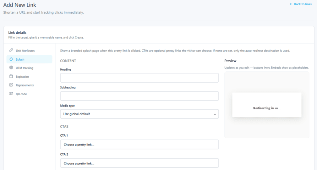
A short window calls for a short list of promotional aspects, so a PrettyLinks splash page keeps its design elements simple to say what you need to say fast with:
- One header
- Supporting body copy
- An image or a video
- One to two CTA buttons
- A countdown timer
What Doesn’t Go on a Splash Page
With a splash page, you’re writing to someone who’s already halfway gone to whatever product link they clicked on.
So everything on that screen has to either push them closer to purchasing or offer something genuinely better to do instead.
That rules out a handful of things you might otherwise be tempted to add, such as:
- A retelling of the product they just clicked. Wherever that link sat, your copy around it already sold them. Repeating the pitch here puts the same words between a sold reader and the conversion.
- An offer unrelated to what they clicked. Whatever they clicked tells you what they’re in the mood for. Someone headed for an inflatable pool wants a coupon code or the upgraded model, not your snow shovel recommendation.
- Long stretches of copy. If your message reads out to be a full paragraph, it belongs in the blog article or on the landing page where you’ve got the room for it.
A good rule of thumb to keep in mind is: every extra second someone spends reading your splash page is borrowed against a sale you most likely already earned. Make it worth the delay, or don’t put it there.
12 Splash Page Examples Worth Setting Up On Your Affiliate Links
A splash page can play a lot of roles — salesperson, host, gatekeeper, you name it — and which one it takes on depends on what you want out of the click.
Let’s dive into how affiliate marketers can use splash pages across their WordPress sites, grouped by the job you’re asking that screen to do.
Splash Pages that Go After More Revenue
The splash page strategies in this section all put a more profitable offer in front of your reader, which is why they carry the most earning potential on this list.
However, it shouldn’t go without saying that they also come with the most risk.
By introducing a different offering, you’re disrupting the buyer journey your reader was already on, and anyone who takes you up on it didn’t finish the purchase they clicked for.
That’s why these splash page types should never go up without a safety net, and PrettyLinks gives you two to work with:
- Your auto-redirect keeps it from being a total loss, since anyone who hesitates still lands on the product page they were headed to.
- Your second CTA button catches everyone who isn’t sold on the new pitch and sends them on to the original offer that caught their click in the first place.
When your offer lands, you walk away with more than that click was ever going to give you on its own. And when it doesn’t, your reader still ends up where they were originally headed.
1. Promote an Upgraded Offer (Most Popular)
When someone clicks an obvious affiliate link on your site, they know that a product page is waiting on the other side, and they’re going there with every intention of buying.
While you’ve got them in that buying mindset, this is the perfect moment to show them what else is out there.
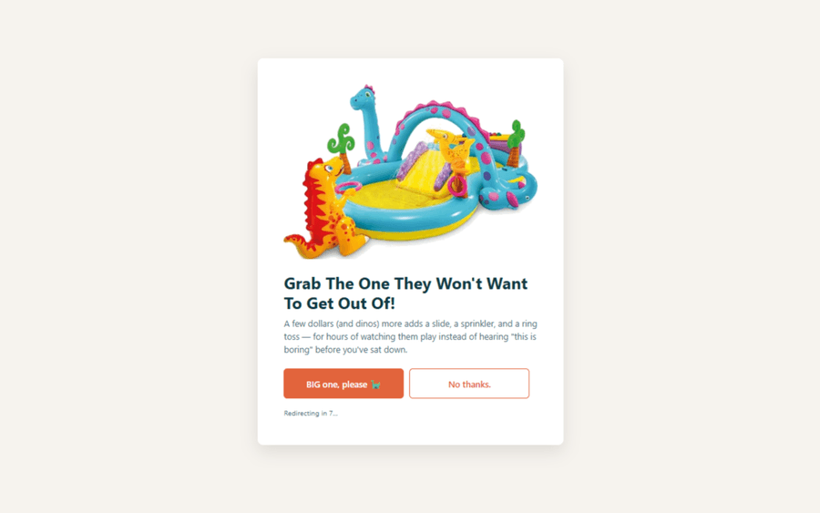
Because someone sold on a product is usually just as sold on the version that comes with more; i.e: the model with the extra features, the bigger size, the bundle that saves them from buying the accessories separately, etc.
That’s the whole reason the upgrade is the most popular play on this list. You’re not pulling anyone away from what they wanted; you’re offering them a better version of it.
Which means the reader who bites is still buying the thing they came for and still earning you a commission — just a larger one!
Here’s an example:
2. Offer the Same Product from Two Merchants
Plenty of the products you recommend are sold in more than one place, and odds are you’ve got an affiliate link for each of them in your collection.
PrettyLinks already gives you a few ways to work with that.
- Link rotation splits your traffic between them and A/B testing tells you which one converts better over time, though both of those make the call for your reader rather than letting them make it themselves.
- A product display gets you a little closer, since it can carry up to two CTA buttons for each merchant right there in your content, but that’s a decision you’re asking someone to make while they’re still reading rather than at the moment they’re ready to buy.
Shopping preference oftentimes decides the sale, because people are particular about where they shop. Some won’t buy anywhere but Amazon, while others go direct for the better warranty, the faster support, or a price that isn’t padded to cover a marketplace fee.
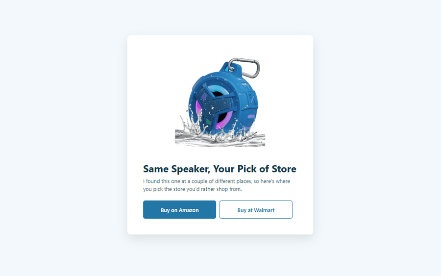
A splash page lets you hand that choice to them at the point of purchase. Your first CTA button points at one merchant, your second points at the other, and whichever one they pick, they’re headed somewhere they were already comfortable buying from, which makes them a whole lot likelier to follow through.
Better still, both of those buttons carry an affiliate link, so there’s no version of this where your reader ends up somewhere that doesn’t pay you.
Here’s an example:
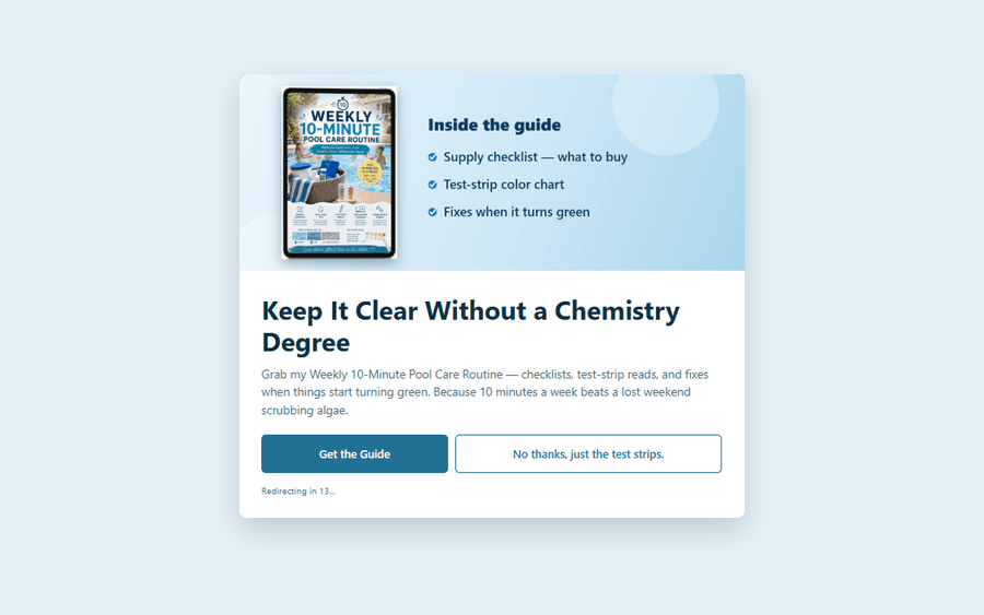
3. Promote Something of Your Own
Affiliate links don’t have to be the only thing you’re promoting on a splash page. If you’ve built something of your own (such as an ebook, an online course, a downloadable template, a membership community), that screen is a great spot to put it in front of the readers most likely to want it.
Similar to the upgrade, you’re pitching another product here. But this one isn’t a step up from what they clicked; it’s something else entirely, and it’s yours. That means 100% of the profit lands in your pocket instead of a mere percentage.
💡This is where PrettyPay™ links come in. Drop one into your splash page CTA and your reader can buy that product on the spot.
Whatever you’re promoting here should still line up with the affiliate link they clicked. Keep it close enough that it reads like one more helpful recommendation instead of a pitch you snuck in on the way through.
Get that part right and you’re doing better than a single sale, because your own products tend to be full of affiliate links themselves. So a reader isn’t just buying your guide; they’re about to spend an afternoon inside something you wrote, clicking the links you put in it.
Here’s an example:
4. Grow Your Email List
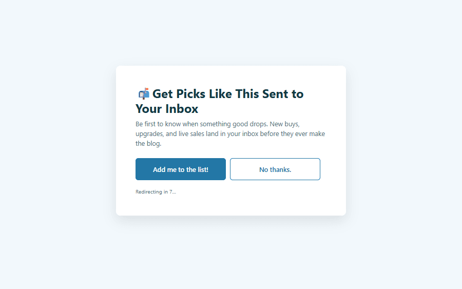
Your email list is one of the most valuable assets you’ll build as an affiliate marketer. A splash page gives you a fresh way to grow it, where every click on your link becomes a chance to turn a reader into a subscriber.
A reader looking at one of your splash pages has already gone deep into your site, reading through your content and acting on the recommendations you made. Inviting them to get those recommendations sent straight to their inbox is a small ask at that point.
I want to be clear on the mechanics here though: a splash page can’t collect anything by itself. What you’re doing is pointing one of your splash page CTAs at your opt-in page, and that form is what does the collecting.
Sending a reader to a signup page does mean giving up the sale you were on track for. But that’s the whole reason this one pays off; you’re not losing a reader, you’re keeping them for every recommendation you make from here on out — for years instead of seconds.
Here’s an example:
5. Run a Sponsor’s Ad
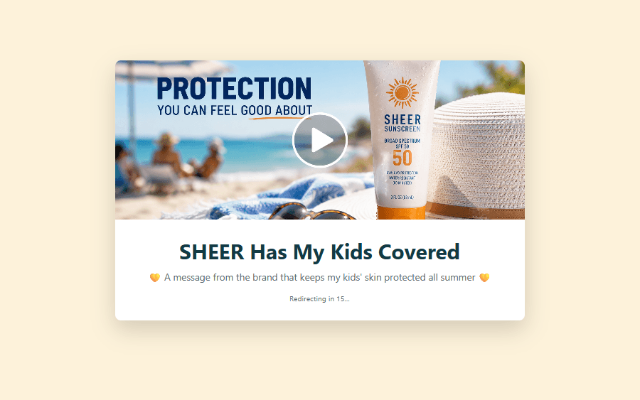
Brand partnerships almost always come with a video ad you’re expected to run somewhere your audience will actually see it.
That’s harder to pull off than it sounds, since dropping a video into the middle of an article interrupts the reader you worked to get, and burying it at the bottom means nobody watches it at all.
A splash page solves that by giving the ad a place to play where nothing else is competing for attention. Your reader is already pausing between the click and the destination, so the video fills a moment that was empty anyway instead of taking one away from your content.
That works out well for everybody involved. Your sponsor gets the views they paid for, your site reads exactly the way it did before, and your reader still lands on the product page they were headed for the whole time.
This one’s also the only play in the group where you’re genuinely earning twice. The ad pays you for the impression, and the affiliate link at the end pays you the commission when they buy, so nothing gets traded away to make room for it.
Here’s an example:
Splash Pages that Smooth the Click
The next set of splash page strategies all work to complement the click your reader already made, rather than pointing them toward something new.
That’s what makes this group so easy to say yes to, because there’s no trade-off to weigh and no commission to gamble with.
Everything on the screen of these splash page examples is working to get your reader where they were already going, just a little more informed, a little more excited, and a little more likely to follow through once they land.
6. Link Out to Your Full Review
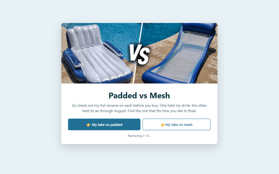
Your affiliate links live in all kinds of content, and some of that content does a lot more convincing than others. For example, a click coming off a full review lands very differently than a click coming off a quick mention in a roundup.
The thinner that content is, the better the opportunity for a splash page to come in and fill the gap.
That screen is where you can give your reader whatever they were missing, whether that’s your full review, the tutorial over on YouTube, or the comparison that lines it up against everything else you’d recommend.
That’s exactly what the reader who wants to learn more before they checkout is looking for, and they’re finding it right at the moment they were about to go without it.
Plus, that review you’re pointing them at carries the same affiliate link anyway, so nothing about this costs you the commission.
You’re just handing a curious reader the version of your work with real weight behind it, which stands a much better chance than a one-line mention ever was going to.
Here’s an example:
7. Share a Coupon Code
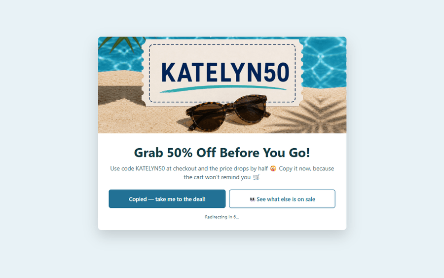
Few things move a buyer like a deal. Whether you’re promoting a sitewide sale or sharing a personal referral code the brand gave you, that discount gives your audience a real reason to act now instead of “maybe later.”
A splash page helps you share that coupon code at one of the best possible moments, right before the product page loads.
Your reader has already decided they want what’s waiting on the other side, so telling them it just got cheaper is the easiest way to seal it.
That screen also makes the code easy to grab on the way through. They copy it right there, land on the merchant’s site, and paste it in at checkout without ever backtracking to your post or trying to remember whether they saw the deal in an email, a TikTok, or somewhere else entirely.
Here’s an example:
8. Explain a Geo-Location Redirect
Sending an international reader to the right store is how a lot of global retailers use splash pages on their own sites, asking shoppers to “pick their country” before they get anywhere near a product page.
Lucky for you, PrettyLinks is a step ahead of that with geo-targeting links, already routing every one of your visitors to the right version of that product on a storefront that actually ships to them, based on nothing more than where their click came from.
What that leaves for a splash page is explaining all of it, because none of that rerouting is visible to the person it’s happening to.
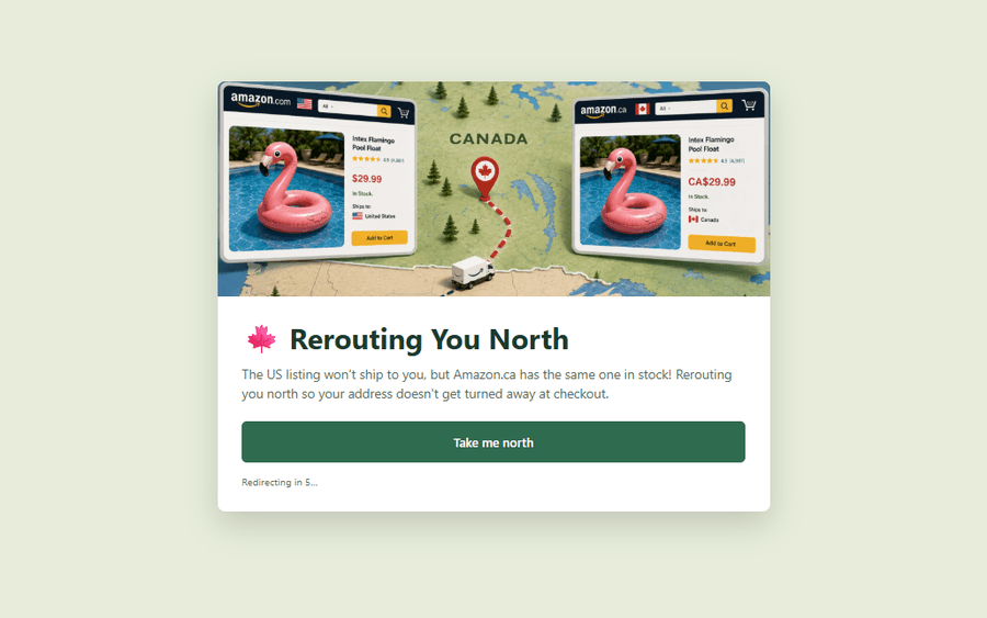
Say a reader clicks through one of your product displays showing the US version of something. You’ve done the work of attaching geo-redirect links for the Canadian version, the UK version, the Brazil version, and so on, but your reader doesn’t know any of that.
All they see is that they clicked one thing and landed on another, sometimes in a currency they weren’t expecting and sometimes on a different product entirely because the one you featured wasn’t available where they live.
A splash page is where you explain all of that before those questions turn into an immediate bounce. A simple message letting them know the product you featured isn’t sold in their region and you’re taking them to the closest thing available clears up the confusion before it costs you the sale.
Here’s an example:
9. Have the Last Word Before They Buy
Whatever sits on a splash page is the last thing your reader hears from you before the merchant takes over. Everything after it belongs to somebody else — their product page, their photography, their copy, their checkout.
Which makes those few seconds the only place left where you get to sound like you. This is where you pull at the heartstrings, dial up the FOMO, or share the more personal details you’d only mention to a friend.
There’s no shortage of ways to use it:
- News or updates about the product. Let your reader know they’re headed for the latest version, the newest release, or the drop that just replaced what you originally reviewed.
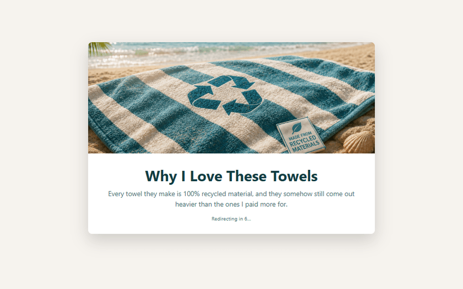
- Something the brand is proud of. Most brands promote a give-back initiative somewhere on their site (i.e a cause they support, a dollar donated from every sale, or packaging they moved to recycled materials), and passing it along works as well for you as it does for them.
- Add a little more FOMO. Put some fire behind the purchase by mentioning that this one sold out three times last year, or that free shipping is only good through the weekend.
- Something personal from you. Whatever you’d say to them if they were standing in front of you. It doesn’t have to sell anything; it just has to be yours.
Any one of those lands harder than it looks like it should, because buying gets emotional right at the end. Your reader decided on the features a while ago, and what closes them now is feeling good about where their money is going.
Here’s an example:
Splash Pages that Cover You
Affiliate marketing comes with a stack of rules — FTC disclosures, program terms, privacy laws, age restrictions — and nearly all of them expect you to tell your reader something before they click.
A splash page is another great way to handle that, and it puts the message exactly where it applies, telling your reader what they need to know about the specific link they just clicked, right as they click it.
10. Post Your Affiliate Disclosure
If there’s one rule every affiliate marketer has to follow, it’s this one. The FTC wants your audience to know that you’re earning on that link, and most programs put the same thing in their terms.
This is another responsibility PrettyLinks takes off your plate, and a legal one at that. It can detect when an affiliate link replacement shows up in a post and automatically attach your disclosure to it, keeping you covered without a second thought.
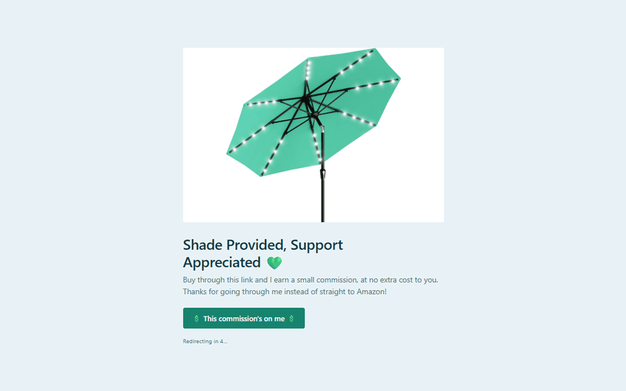
What a splash page gives you is a warmer way to say the same thing. In addition to that disclosure sitting at the top of your post, you get a whole screen to thank your reader for shopping through your link, and to be upfront that their purchase is what keeps your content coming.
Here’s an example:
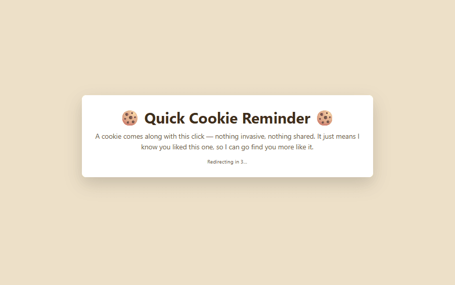
11. Add a Cookie Notice
Disclosures aren’t the only rule worth staying ahead of. If your site sets tracking cookies (and with PrettyLinks logging your clicks, it does), privacy laws like GDPR say you need a visitor’s consent before those cookies fire.
Most of that gets handled site-wide by a consent banner, and PrettyLinks makes it painless with its CookieYes integration: flip it on and your PrettyLinks cookies are categorized and respecting consent automatically.
A splash page lets you add one more checkpoint at the click, for the moments you want to be extra clear. Because let’s be honest, most people dismiss a consent banner on their way in without reading a word of it.
Asking again at the exact moment a link is about to track them is a different kind of transparency. Your reader knows exactly what they’re agreeing to, and you’re not counting on a banner they clicked past ten minutes ago.
Here’s an example:
12. Gate Age-Restricted Content
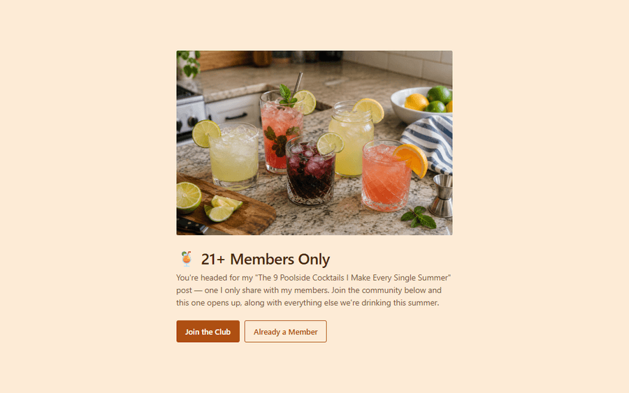
If your corner of affiliate marketing deals in age-restricted content, keeping minors from stumbling into it falls on you. That usually means locking the content behind something sturdy, like a membership or an age check.
To be clear, a splash page isn’t what does the locking. That’s your membership platform’s job, and no screen in front of a link is going to hold anybody back on its own.
🔒 The MemberPress plugin can do the locking for you. Set an age requirement for your membership with its Registration Restrictions add-on, and only people who confirm they’re old enough get to join.
What a splash page does is tell your reader what’s coming. Rather than dropping somebody onto a login wall or an age prompt with no warning, you let them know ahead of time that the page they’re headed for has a requirement attached to it, and what that requirement is.
That way nobody hits a dead end wondering what went wrong. They know what’s waiting, they know whether they qualify, and they can decide what to do about it before they get there.
Here’s an example:
Build Your First Splash Page
There you have it — 12 splash page examples, every one of them built with the PrettyLinks plugin.
After all that, you’ve probably got a design in mind for a link sitting in your collection right now, which is exactly where we’d tell you to start.
Pull up our support doc on how to build a splash page and follow along as you set one up for your highest-earning affiliate link, since that’s the one with the most to gain from a little extra attention.
Once it’s built, give it a couple of weeks and watch what that little screen does for you. That part’s the easy bit to keep tabs on, since PrettyLinks tracks every click on your splash page, how your readers engage with it, and everywhere they head off to from there.
Then don’t forget to come back and tell us all about it, because some of the best uses of our tools come from customers who found something we never planned for.
Drop a comment below with what you built and what it did for that link. If you came up with something that isn’t on this list, that’s the one we want to hear about most!


Leave a Reply