5 Things You Can A/B Split Test On Your Affiliate Site (and How to Do It)
Contents
Have you ever looked at your website and thought, I wonder what people will make of this layout?
You're not alone. The challenge for most website owners is getting into the heads of their visitors and trying to figure out what makes them click – or, even better, make a purchase.
With A/B split testing, you can do exactly that. It's a focused method that allows you to test two different versions of a specific element on your site – be it a call-to-action button, a headline, or even a link. The aim is to see which version gets better engagement from your visitors.
This isn't just throwing stuff at the wall to see what sticks. It's a data-driven strategy designed to improve your site's performance, attract more visitors, and increase your sales.
In this guide, you'll get the lowdown on A/B split testing. Then we’ll hand you a list of 5 elements you can start testing on your site right now to get a better feel for your audience.
Don’t worry though, we won’t leave you trying to figure it out all on your own. We'll wrap things up by showing you how to get these tests rolling with Pretty Links.
What is A/B Split Testing? (and Why Should You Use It)
A/B testing is a more focused form of split testing. Essentially, you take two versions of a web page that are exactly the same, except for one thing – maybe a button color, a keyword, or a page header – and see which one gets more clicks or engagement.

For example: Let's say you've got an affiliate link hiding at the bottom of your blog posts, and it's basically getting zero love. Why not run an A/B test to see if moving that bad boy higher up the page makes a difference?
Half your visitors would see the link in its old spot, and the other half would see it in the new one.
Boom! Now you've got real data to show you where that link should live, taking the guesswork out of your marketing and design decisions.
And the best part? A/B testing is as straightforward as it gets. It offers a simple yet powerful way to refine your strategies and improve your website's performance without spending a lot of time or resources.
5 Elements You Can Easily A/B Test on Your Site
With a better understanding of how A/B split testing works, now you're probably wondering, “What should I test on my site?”
Don't stress, we've got a shortlist of 5 things you can start playing around with.
1. Consider the Placement & Appearance of Your Affiliate Links
The placement of affiliate links in your content can greatly affect how many clicks they get. Links buried deep in the article might be overlooked, while those too upfront might seem pushy.
What to test: You can try placing the affiliate links at the beginning, middle, or end of your content. You might also want to test embedding links in images or text to see which is more effective.
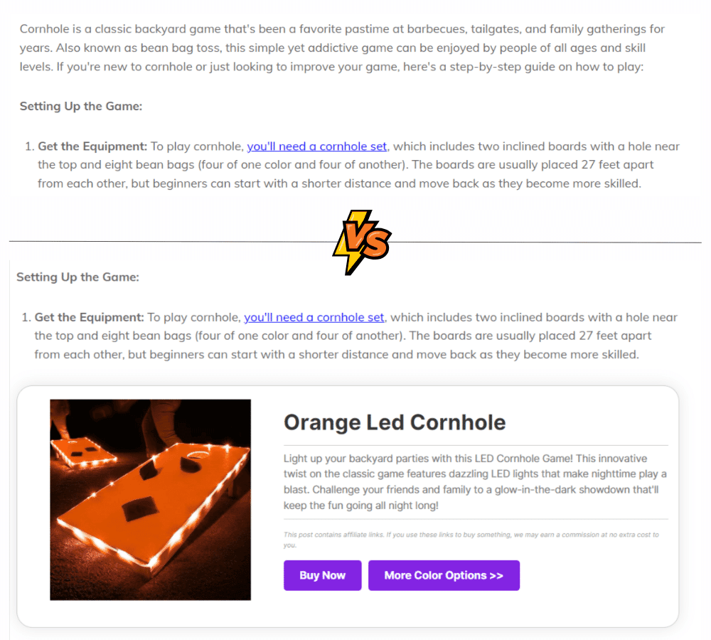
But don't stop there! Consider turning your links into eye-catching product displays. Instead of just hyperlinking some text, make your links into interactive showcases. It's a fun twist that could get your audience clicking like there's no tomorrow.
2. Get Creative with Your CTA Buttons
CTAs are crucial in guiding visitor behavior and leading them toward making a purchase or taking another desired action.
What to test: Experiment with different button colors, sizes, texts, and placements. For instance, you might want to find out whether a “Buy Now” button generates more clicks than a “Learn More” button. You can also test color psychology – does a fiery red button scream “Click me, ASAP” more than a calming blue one?
3. Headlines that Make People Look Twice
The headline is usually the first thing that catches the eye when a visitor lands on a page. An intriguing headline can make the difference between a quick exit and a deeper dive into your content.
What to test: Try varying your headlines to emphasize different benefits or features of the affiliate products you're promoting. For example, test a benefit-driven headline like “Transform Your Skin in 30 Days” versus a feature-driven one like “Natural Ingredients for Healthy Skin.”
4. Fiddle Around with Your Content Format
The way you present content can impact its effectiveness in promoting affiliate products. Some audiences may prefer detailed reviews, while others like quick, scannable listicles.
What to test: If you're using various content formats – such as articles, reviews, or how-to guides – test which type results in the most engagement and conversions. You might discover that a detailed review with pros and cons generates more trust and sales than a shorter listicle.
5. Product Specifics that Pique Reader Interest
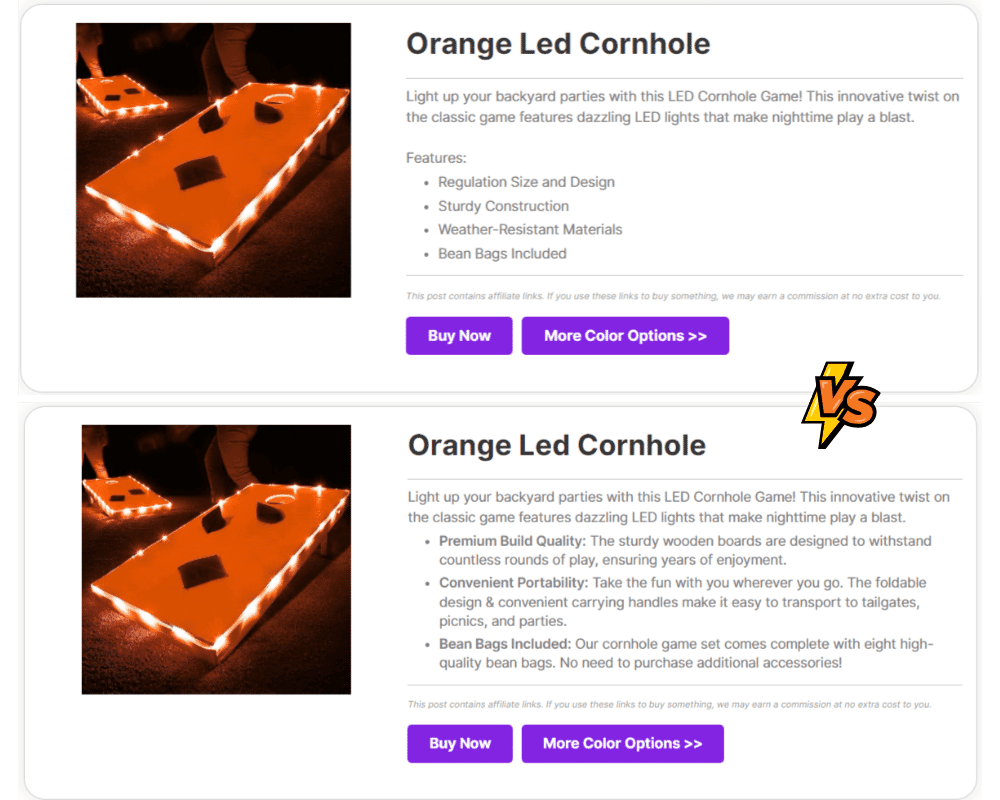
If you've got an affiliate product that's a fan-favorite, how about giving it the spotlight in two different versions of the same blog article? You could focus on different aspects of the product in each version to see what really grabs your audience's attention.
What to Test: In one version of the article, emphasize the product's top features. In the second version, play up the benefits it brings to the user. Then, track clicks to see which angle your audience finds more compelling.
How to Set Up an A/B Split Test Using Pretty Links (In 3 Steps)
Pretty Links' rotation feature enables you to easily perform split tests on your affiliate site. In just 3 simple steps, you'll be gathering insights like a champ.
Before you can set up your A/B split test, you’ll need to create two versions of the web page you're testing. REMEMBER: It's vital the two pages are identical except for the ONE thing you wanna test.
Once your pages are prepped, Pretty Links takes care of generating clean URLs for each version automatically, so you're all set to initiate your A/B test.
Step 1: Set Up Your A/B Split Test Report
First, let's set your split test up for success by making sure you're collecting data from the get-go with a Pretty Links Report.
Head over to Pretty Links > Options. From there, find the “Reporting” section:
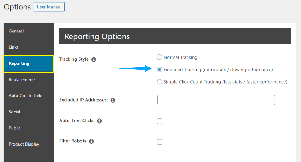
Opt for “Extended Tracking” under “Tracking Style”. After you make that selection, scroll down and hit the “Update” button.
Now you're primed to automatically gather all the valuable insights you'll need once your split test kicks off.
Step 2: Select Your Version A Page Link
After setting up your report, the next step is picking your “A” version page link. So hop into your pretty links collection find the link you're eager to split test, and click “Edit”.
Or if you're starting fresh, just go ahead and create a new link.
Step 3: Create Your A/B Split Test
First things first, split testing is a VIP feature available to our pro users. If you're not seeing that “Pro” tab in the link editor, it's time to level up your Pretty Links plan.
In the Pro tab, look for the “Dynamic Redirection” dropdown and select “Rotation.” Your A version is already set – just click “Add Link Rotation” to plug in your B version.
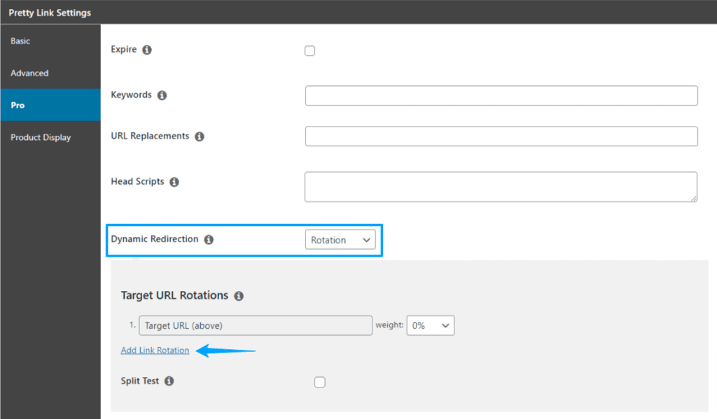
Although you can throw in up to 20 alternate URLs, we suggest you keep it simple with just two to start.
You can assign a “weight” to each URL. But honestly, keeping it at a 50-50 split usually works best. That way, half your visitors will see Page A, and the other half will get Page B:

Last but not least, tick the “Split Test” box and pick a “Goal Link.” This is the link you really want to keep tabs on. Maybe it's an affiliate link for a hot product – you'll get to see how it performs on both page versions.
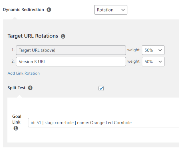
After you've set it all up, a “Split Test Report” link will pop up. Unlike other Pretty Links reports, you'll need to sit tight until the data starts rolling in.
But don't fret—it usually fills up pretty fast!
Analyze Your Split Test Results: The Moment of Truth
Alright, you've set up your A/B test and it's doing its thing. Our pro-tip? Let it run for at least two weeks to get some quality data. And whatever you do, resist the temptation to tweak anything mid-test; you want those results pure and unbiased.
You can, however, peek in on your results from time to time by jumping back to that “Split Test Report” link. You'll see a nifty graph that shows how your pages are stacking up:
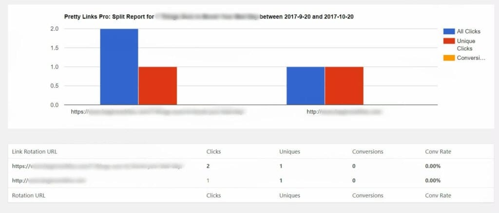
At this point, you can use the information you've gathered to make improvements to your affiliate content. If one page is the clear winner, give it the crown and make it your go-to.
But if both pages are more meh than YEAH, you might want to run more tests, maybe shake things up with new variations, until you hit that performance sweet spot.
Conclusion
Guesswork rarely cuts it when you're aiming for consistent affiliate revenue. That's where split testing steps in, taking the “what ifs” out of the equation and giving you the data-driven insights you need to succeed.
Here are some quick tests to kick things off:
- Consider the Placement & Appearance of Your Affiliate Links
- Get Creative with Your CTA Buttons
- Headlines that Make People Look Twice
- Fiddle Around with Your Content Format
- Product Specifics that Pique Reader Interest
Put these tests into action and let the data guide you to a more effective, click-worthy site. Who knows? The next big boost in your revenue could be just one test away!
Do you have any other questions about A/B testing? Let us know in the comments section below!
If you liked this article, be sure to follow us on Facebook, Twitter, and LinkedIn! And don't forget to subscribe in the box below.