
Contents
For many websites, a primary goal is to make sales or encourage some other type of conversion. However, if your messaging is too vague, potential customers may not know what to do. This can make it a lot less likely that they’ll take desired actions.
The good news is that you can resolve this problem with a strong Call to Action (CTA). This is a clear, direct message that prompts users towards doing something specific. Putting together a clear, attention-grabbing CTA is your best chance to make sure your site’s content and messaging are truly effective.
In this article, we’ll offer several tips for how to create better CTAs. First, however, let’s look at some examples!
A Brief Introduction to CTAs (And Why They Matter)
As we mentioned earlier, a CTA is a statement urging people to take a specific action. CTAs can improve your Click-Through Rate (CTR), and drive more conversions. They’re used in a wide variety of contexts, but are particularly relevant online.
It’s crucial to use one or more strong CTAs on your website. Without one, your site can appear disorganized, and its purpose may be unclear. In the example below, for instance, it’s hard to say what the site owner wants users to do:
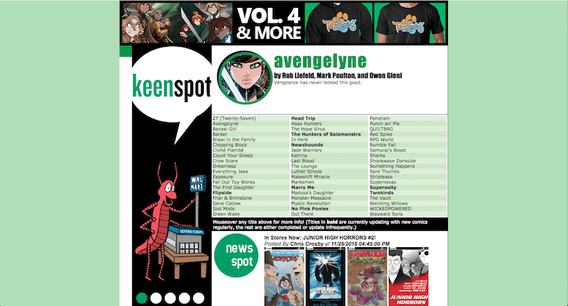
If a visitor isn’t sure about what action to take after spending 15 seconds or so on your website, they may abandon it altogether.
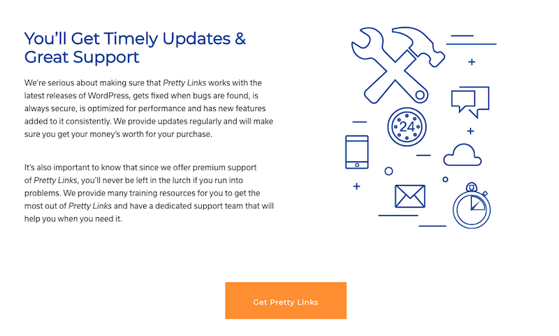
On the other hand, when done right CTAs are attention-grabbing and promote a clear course of action. For example, the Get PrettyLinks button at the bottom of our own About page stands out from the rest of the design. Even if a visitor skims over the block of text, they will still be drawn to click on the button:
 CTAs can make or break your site, particularly if you’re using it to make a living. That means it’s crucial to take special care with their messaging and design.
How to Write an Effective CTA for Your Website (3 Key Tips)
Fortunately, it isn’t hard to make your CTAs more effective. All it takes is implementing a few vital but easy-to-understand strategies. In the next few sections, we’ll look at three of the most important techniques.
1. Be Specific and Clear
First and foremost, your CTA should be designed to focus on a single goal. This may seem obvious, as a CTA by definition encourages one particular action. However, you’ll want to consider how you can narrow your CTA down to be as specific as possible.
Ideally, a CTA should lead to something that the user can achieve in just a few minutes (or less). For example, instead of saying “Check out our winter clothing!”, which is a very broad request, you may want to point visitors towards a single new item you want them to consider buying. A stronger CTA might be: “Get our new, 100% organic cable-knit sweater now!”
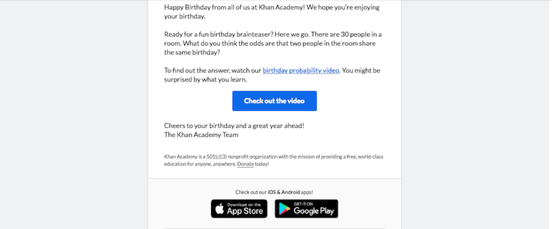
It should also be very clear to the user what will happen when they click on the CTA. For example, in this email from Khan Academy, it’s immediately obvious that if you click on the button you’ll be taken to a video:
It isn’t enough to drive clicks – if a user is taken to a page they weren’t expecting, they may leave your site. So avoid unclear and generic CTAs like “Check it out!” or “Visit now!”, unless you’re positive the user will know exactly what they mean.
2. Make the CTA’s Benefits Obvious
It’s also important that your CTA includes a reason for visitors to act. For example, announcing a discount code with a specific cut-off time may inspire them to browse your online store to look for a deal. In the email ad below, the CTA is “Last Chance: 20% Off Pro”:
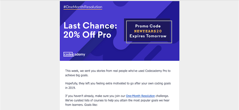
If a customer was already thinking about purchasing your product, the discount deadline may be the final nudge they need. In this scenario, the benefit to them is saving money on the item.
A CTA’s goal can also be as simple as explaining why customers may enjoy your product, or giving an example of how it can improve their lives. Either way, this element is crucial to increasing your conversion rate. Unless you give people a reason to act, they may ignore the CTA entirely.
For example, if a logged-out user visits Facebook, they’ll see the Sign Up button along with the message “Connect with friends and the world around you on Facebook”:
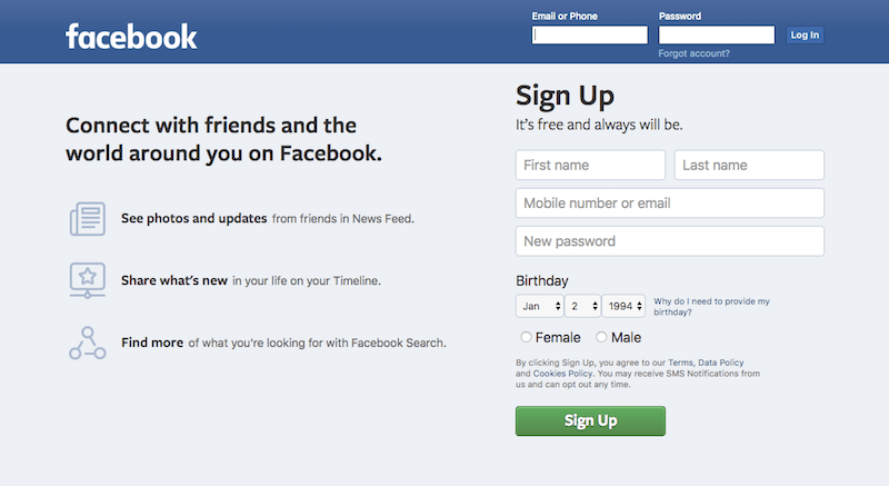
This gives users a clear action to take. What’s more, it clearly explains why taking that action will be beneficial.
3. Use Compelling Language
If you really want your CTAs to be effective, it’s also smart to use compelling language. Your instinct may be to choose superlatives like “the most comfortable” or “the best sweater.” However, this terminology may actually come off as generic, producing the opposite effect from what you want.
On the other hand, CTA phrases that work tend to use simple language that piques curiosity, such as “learn more” or “explore”:

Your grammar and sentence structure can also have a significant impact. For example, active language is better than using a passive voice. You’ll also want to keep your CTAs short and sweet – somewhere between two and seven words is usually best:

In particular, CTAs that appear on buttons should be very short. Stick with a two- or three-word phrase, such as “Meet Our Team” or “Donate Now.”
How to Track Your CTAs
Once you have a strong CTA in place, it’s also important to track and monitor its results. You need to know how effective your CTAs are, in order to tweak the ones that don’t work or re-use elements from the ones that did prompt conversions.
To do this, you can use link tracking in PrettyLinks to break down your traffic sources by campaign. By setting up link tracking, you’ll be able to see where your traffic is coming from. For example, you may notice that one CTA works very well in emails, but is failing on social media.
PrettyLinks will also cloak the tracking elements in your links. This means you can add in as many elements as you need, but users won’t see a long, messy chain of codes. You can even use A/B testing to pit two CTAs against each other, and see which is most effective. Perfecting CTA design takes time, but tracking results this way can really speed up the process.
Conclusion
Technically speaking, any phrase encouraging action can be considered a CTA. However, that doesn’t mean they’re all equally effective. You can make your CTAs even better by using a few simple techniques to improve their effectiveness, and then tracking the results.
To recap, the three best ways to get more results from your CTAs are:
- Be specific and clear.
- Make the CTA’s benefits obvious.
- Use compelling language.
Do you have any questions about crafting strong CTAs for your website? Let us know in the comments section below!


Leave a Reply