How to Optimize Your Webpage Copy: F-Shaped vs Z-Shaped Layouts Compared
Contents
Building a successful affiliate website is more than just selecting the right fonts – it’s designing your site to align with how visitors naturally interact with online content.
Unlike reading a book, web users tend to scan content, quickly looking for key information that stands out. Understanding this behavior is crucial for directing attention and boosting conversions.
Let’s break down the 2 most popular scanning layouts:
- The F-Shaped Pattern: This layout is excellent for text-heavy pages, aligning with the typical pattern of how readers scan large blocks of text.
- The Z-Shaped Pattern: When you’re mixing text and visuals, this layout guides the eyes in a dynamic “Z” formation, perfect for emphasizing calls to action.
In addition to exploring these patterns, we’ll discuss how Pretty Links can help you seamlessly test different page designs to see which layout maximizes engagement and conversions.
Learn why strategic placement of your content and CTAs, coupled with easy A/B testing using Pretty Links, can make a real difference.
Understanding the Difference Between Z-Shaped and F-Shaped Layouts (+ Examples)
It turns out there’s a bit of science behind webpage design. Eye-tracking research has revealed that people generally follow specific patterns when scanning digital content, including web pages.
Essentially, the natural eye movement of someone browsing a webpage often traces the outlines of either an “F” or a “Z”.
Visualizing these patterns as overlays on a webpage can provide invaluable insights. It helps you understand where visitors are likely to focus their attention and in what sequence.
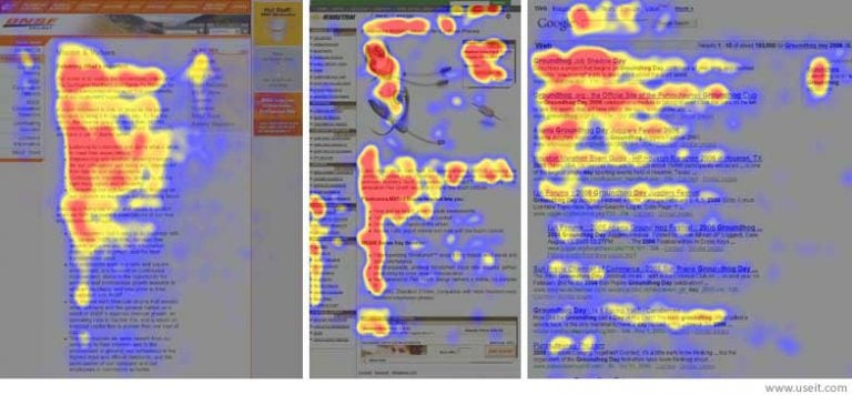
This knowledge is crucial for designing web pages that are not only visually appealing but also highly effective in guiding users towards actions like clicks and purchases.
By leveraging these insights, you can craft web designs that are more engaging and tailored to the natural reading habits of your audience.
The F-Shaped Website Pattern Explained
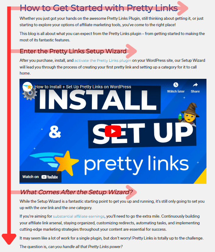
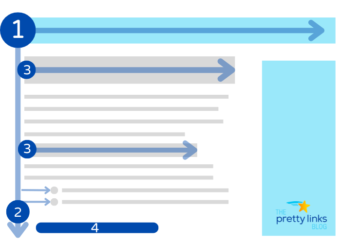
The F-pattern is how we typically read heavy text content. It starts at the top, where users first focus on the headline.
Then, their eyes tend to move down the left side of the page, skimming for standout bits or key points in the content.
Occasionally they’ll dart across the page by a longer headline or a bolded piece of text.
This pattern is ideal for pages filled with text where readers want to quickly grasp the main ideas without reading every word.
When to Use the F-Pattern in Web Design
- Blog Articles: These are a natural fit for the F-pattern. Readers generally scan vertically down the left, pausing to read horizontally when something catches their interest.
- Forums and FAQ Sections: These pages benefit immensely from the F-pattern. Users scan for specific questions or topics on the left and then move across to read the answers.
- Search Engine Results Pages (SERPs): Notice how you scan Google’s results? You're likely using the F-pattern, focusing on titles and meta descriptions to find what you need quickly.
By understanding and applying the F-shaped pattern, you can enhance the usability of your site, making it easier for visitors to find and engage with the content that matters most to them.
The Z-Shapped Website Pattern Explained
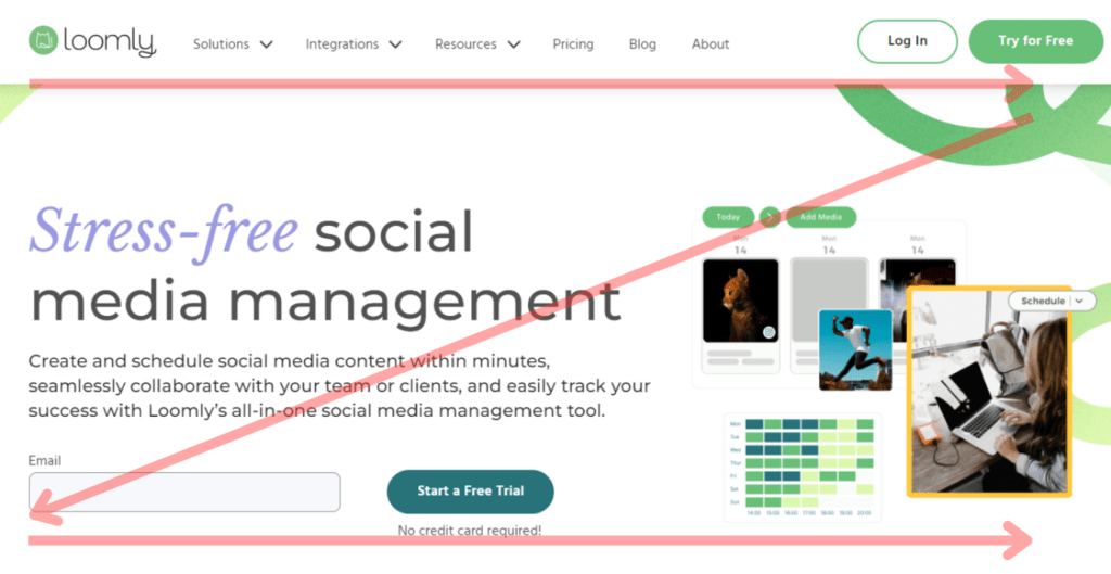
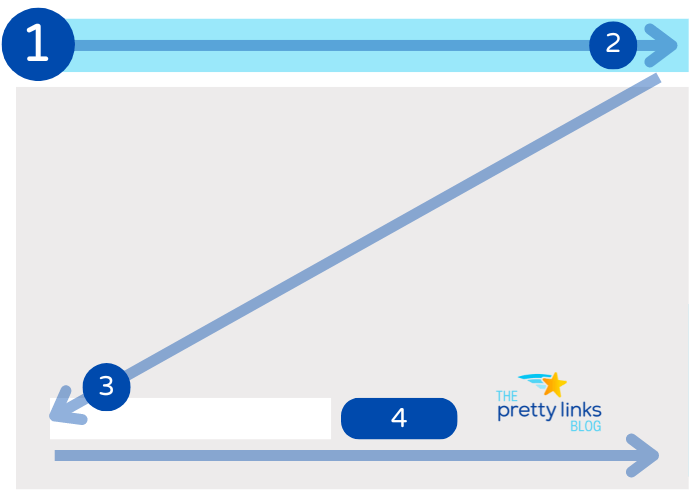
The Z-pattern guides the eye in a dynamic zigzag motion across the page, making it superb for pages that are visually driven rather than text-heavy.
Visitors start at the top-left corner, zip straight across to the top-right, then diagonally down to the bottom-left, and finally dart over to the bottom-right.
This quick sweep is perfect for capturing attention on pages where visuals lead the way, like homepages, ads, or impactful landing pages.
When to Use the Z-Pattern in Web Design
- Homepages: The Z-pattern shines on homepages designed to make a strong, visually striking first impression. It works well for sites that have a clear message, a single call-to-action (CTA), or minimal content.
- Single-Action Landing Pages: Ideal for pages with minimal content where the primary goal is to funnel visitors towards a specific action, such as signing up or contacting the company.
- Product Showcase Pages: This layout excels at presenting products in a sequential flow that naturally leads users from one item to the next, enhancing the browsing experience.
The simplicity of the Z-pattern not only makes it versatile but also allows for easy adjustments to suit different design needs and objectives.
By strategically placing key elements along the Z’s path, you can create a compelling visual narrative that guides visitors towards your desired action.
Optimizing Engagement with the F-Shaped Layout
Using the F-shaped pattern for your content-rich web pages can effectively guide readers through your content, setting the stage for deeper engagement.
Here’s how to best apply the F-shaped layout to captivate your audience:
- Start at the Top: This is where the engagement journey begins. In the F-shaped layout, users typically scan across the top first. Use this area for compelling headlines or essential information that grabs attention.
- Down the Left Side: The eye naturally moves down the left side next. Utilize this area for easy navigation through your content with subheadings, bullet points, or short paragraphs. These elements should break up the text and make it easier to scan, drawing the reader deeper into the page.
- Horizontal Scans for Details: When something catches the reader’s interest on the left, they typically scan horizontally to the right for more details. This part of the “‘F” is where secondary CTAs can be strategically placed to catch the eye without overwhelming.
- Concluding with the CTA: Place your primary CTA at the end of your main content where the F-pattern naturally concludes. At this point, users have engaged with your content and are more prepared to take action.
By structuring your page according to these principles, you not only enhance the user experience but also increase the likelihood of converting readers into action-takers.
Maximizing Conversions with the Z-Shaped Layout
The Z-pattern layout is designed for immediacy, guiding the viewer quickly from introduction to action, perfect for sites focused on conversion rather than detailed information.Here’s the path you want to create for your readers to do just that:
- Initial Attention: Start at the top-left corner, the beginning of the ‘Z'. This prime spot should host your main message or headline, setting the stage for what’s to come and capturing immediate interest.
- Horizontal Movement: As the eye tracks horizontally to the top-right, the second point of the ‘Z', use this area for secondary yet crucial information, like key benefits or a compelling graphic. This keeps the momentum and builds upon the initial message.
- Diagonal Downward: The eye then makes a diagonal move to the bottom-left, the third point of the ‘Z'. This space is ideal for additional supportive content or visuals that reinforce your message and prepare the viewer for action.
- Final Horizontal Line: The last leg of the journey is the final horizontal sweep to the bottom-right corner. This spot is critical for placing your main Call to Action (CTA). It's where the viewer’s eye naturally rests after scanning the layout, making it the perfect position for a conversion prompt. This is the moment when the viewer is most ready to take action, having absorbed all preceding information.
By organizing content along the Z-shaped path, you create a natural flow that leads visitors directly toward taking decisive action, enhancing the conversion potential of your page.
Mix It Up: A/B Testing to Find Your Best CTA Placement
In both the F-shaped and Z-shaped patterns, maintaining a clear hierarchy of information is key. You want to guide the viewer’s eye toward your CTA in a natural and compelling way.
Utilizing visual elements such as contrasting colors, ample whitespace, and directional cues can significantly enhance the visibility and appeal of your CTA.
However, the impact of CTA placement isn’t one-size-fits-all; it can vary greatly depending on your specific content and audience. This variability underscores the importance of using A/B testing to fine-tune your website.
By systematically testing different versions of your page layout, you can identify which elements most effectively drive user engagement and conversions.
Next, let’s explore how you can leverage split testing to optimize these layouts for maximum effectiveness.
How to Split Test Your Web Pages with Pretty Links
To truly tailor your website for peak performance, A/B testing is an invaluable strategy. It allows you to compare two versions of a page to see which one performs better in terms of user engagement and conversions.
With Pretty Links, you can easily set up A/B tests with minimal fuss, getting clear, actionable insights faster.
Why Conduct A/B Testing?
A/B testing is essential because it removes the guesswork from website optimization. Each element on your site can affect user behavior, and what works for one audience might not work for another.
By testing different layouts, you can:
- Enhance User Experience: Identify which design elements resonate best with your audience.
- Increase Conversions: Learn which arrangement of components, such as text and CTAs, drives more actions.
- Reduce Bounce Rates: Improve the overall appeal of your pages, keeping visitors engaged for longer periods.
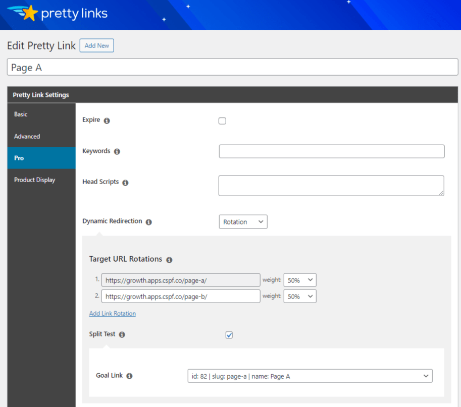
How to Set Up an A/B Test with Pretty Links
- Choose the Elements to Test: Decide whether you’re testing the entire layout or specific elements like headlines, images, or CTA placements.
- Create Variations: Generate two versions of your page. For instance, one with an F-shaped layout and another with a Z-shaped layout.
- Direct Traffic: Split your incoming traffic between these variations using Pretty Links link rotation. Ensure each version receives equal exposure to obtain reliable data:
With Pretty Links, you can easily analyze the performance data of each link. Identify which page variant is bringing in more conversions and optimize your strategy accordingly to enhance your earnings.
This approach to A/B testing not only maximizes the effectiveness of your website designs but also aligns perfectly with the evolving preferences of your audience, keeping your site both current and competitive.
Conclusion
Understanding and applying the F-shaped and Z-shaped patterns can greatly improve how visitors interact with your website, boosting both engagement and conversions.
But the work doesn’t end with layout design. Continual optimization through A/B testing is crucial.
Tools like Pretty Links streamline this process, enabling you to effortlessly test and refine different layouts to discover what truly resonates with your audience.
This cycle of testing, learning, and optimizing ensures your website remains effective, engaging, and aligned with your visitors’ needs.
Keep exploring, testing, and improving – your website’s success depends on it!
Are you ready to start A/B testing your content with Pretty Links? What’s the first experiment you plan to run? Share your ideas with us in the comments section!
About Katelyn Gillis
Meet Katelyn: your go-to gal for all things digital marketing. Holding the fort as a Copywriter II, she’s the friendly voice behind the insightful Pretty Links blog articles you know and love. What sets Katelyn apart isn't just her deep devotion to topics like affiliate marketing, SEO, and link management; it's her knack for turning complicated jargon into fun, friendly advice. Katelyn doesn't simply write about the digital landscape, she navigates it daily; staying ahead of trends and changes to ensure her readers are always in the know. She’s not here to bombard you with facts either; she’s passionate about strengthening your online marketing strategies, helping you discover new paths and the potential they hold.