Contents
When your business hits a wall, finding new ways to increase sales can be challenging. If you don’t have a clear strategy to gain new customers, you likely won’t be able to grow your business.
Fortunately, a well-crafted landing page can help you drive conversions. Leveraging a single, highly focused page can get visitors to sign up for your email list, ultimately starting them on the sales journey with your company.
In this article, we’ll introduce landing pages and why they are important for any successful business plan. Then, we’ll explore four ways you can optimize your landing pages to gain leads. Let’s jump right in!
Why Landing Pages are Essential for an Effective Ecommerce Strategy
A landing page is a self-contained web page that users are directed to after clicking an advertisement, an email link, or some other call to action (CTA) on the web.
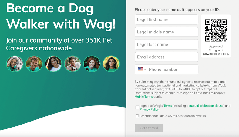
Occasionally, landing pages appear directly on an ecommerce website. However, they are typically separate, standalone web pages. They serve as a particular landing point for a campaign, event, sale, service, or topic promotion.
That’s why a landing page isn’t usually included in the internal navigation of a website. It’s aimed at a highly-targeted audience for a set period of time.

Furthermore, landing pages usually include features like CTA buttons, signup forms, a clear message, and a simple design that adheres to your brand. Their principal goal is to generate leads by gathering contact information. Often, this is in exchange for something of value to the user, such as a promotional code or a free resource.
If you have a landing page that is well-crafted and implements best practices, you can usually expect a higher conversion rate. That’s because these pages provide the right information to the right audience.
How to Optimize Your Landing Pages (4 Tips)
As we have learned, landing pages can be a powerful tool. However, they will be much more effective if you optimize them for maximum conversions. Now let’s explore four tips for creating a successful landing page that generates leads for your ecommerce business.
1. Carefully Craft Your Call to Action (CTA)
Too much information will likely overwhelm your visitors. Therefore, using just one CTA on your landing page will help establish a clear end goal for your visitors.
Instead of providing numerous popups or forms that leave your visitors’ heads spinning, it’s best to hone in on one clear message. This Bills.com example provides a single CTA button that reads Continue. On this landing page users can easily take action, since there is only a single path forward:
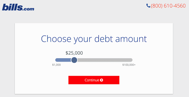
With this in mind, you may want to craft a specific CTA by creating an action button that leads to a signup form. You’ll also want to ensure that your CTA button is concise and easy to read.
Ideally, it would also be above the “fold” of the page. This simply means that it should be at the very top of the landing page, so your visitors don’t have to scroll in order to take action.
2. Create a Minimalist Design
A good landing page design will be clutter-free and adhere to your visual brand. This can help reduce distractions, and allows your main goal to take center stage. Overall, your aim should be to create a minimalist design.
In addition to your logo, you’ll want to feature the same color palette and lettering that appears on your website. This way, users won’t be confused about where they’ve ended up. If images will further support your overall goal, you may want to include one or two high-quality photos.

Additionally, if you have the resources, you can even include a video that displays or demonstrates your product, service, or promotion.
To make things extra easy for the reader, consider using large fonts or headings. This can help keep your visitors’ eyes focused on the goal of your landing page.
PrettyLinks can also keep your page simple by consolidating messaging information:
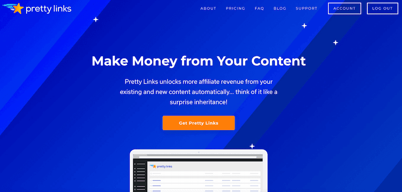
Our plugin can help you transform long and unsightly affiliate URLs into clean, shareable links. This way, you can include them on your landing page without hurting your minimalist creation.
3. Use a Smart Form Builder
Forms also play a crucial role in landing pages. They are often the main element on the page and are found near the CTA.

As with the rest of your page design, try using a limited number of fields in your forms. The simpler the action is, the higher the likelihood of lead generation.
You can also use a smart form builder that makes the process easier. Ideally, it should be able to integrate with your other marketing tools. This can allow you to track leads in the sales funnel, and will ultimately facilitate easy conversions.
Formidable Forms is a WordPress plugin that allows you to easily create a wide variety of useful forms, including ones for lead capture:
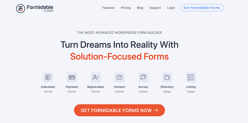
With this tool, you can choose from tons of pre-made form templates. Then you can customize them to fit the needs of your landing page with a drag-and-drop form builder.
4. Try A/B Testing
Another excellent way to optimize your landing pages is by conducting A/B testing. To do this, you can create two separate pages with minimal differences. Then you can observe which performs better.
Here are some landing page elements that you may want to tweak when A/B testing:
- Images
- Headings
- CTAs
- Button color, size, and placement
- Form elements
Once you’ve determined which page performs better, you can stop using the less successful one. This will help you generate leads more quickly, and get you closer to making conversions.
If you’re not sure how to get started with this tactic, the Nelio A/B Testing plugin can help you out:
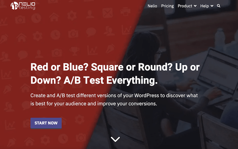
This tool lets you test alternative names, images, and descriptions, as well as orders and conversion actions. Plus, it’s also compatible with WooCommerce.
Conclusion
Optimizing your landing pages can be tricky. However, adhering to certain best practices such as clear messaging and a minimalist design can help you capture leads fast. This in turn can increase your site’s conversion rates and grow your business.
To summarize, here are four ways you can optimize your landing pages:
- Create a single, direct Call to Action (CTA) and place it above the page fold.
- Choose simple, on-brand design elements and use PrettyLinks to shorten ugly URLs.
- Use a smart form builder such as Formidable Forms.
- Test two alternative landing pages with a tool like Nelio A/B Testing.
Do you have any questions about optimizing your landing pages to increase conversions? Ask us in the comments section below!
If you liked this article, be sure to follow us on Facebook, Twitter, Pinterest, and LinkedIn! And don’t forget to subscribe to our newsletter!






Leave a Reply