
Set Up to Convert in Just a Few Clicks
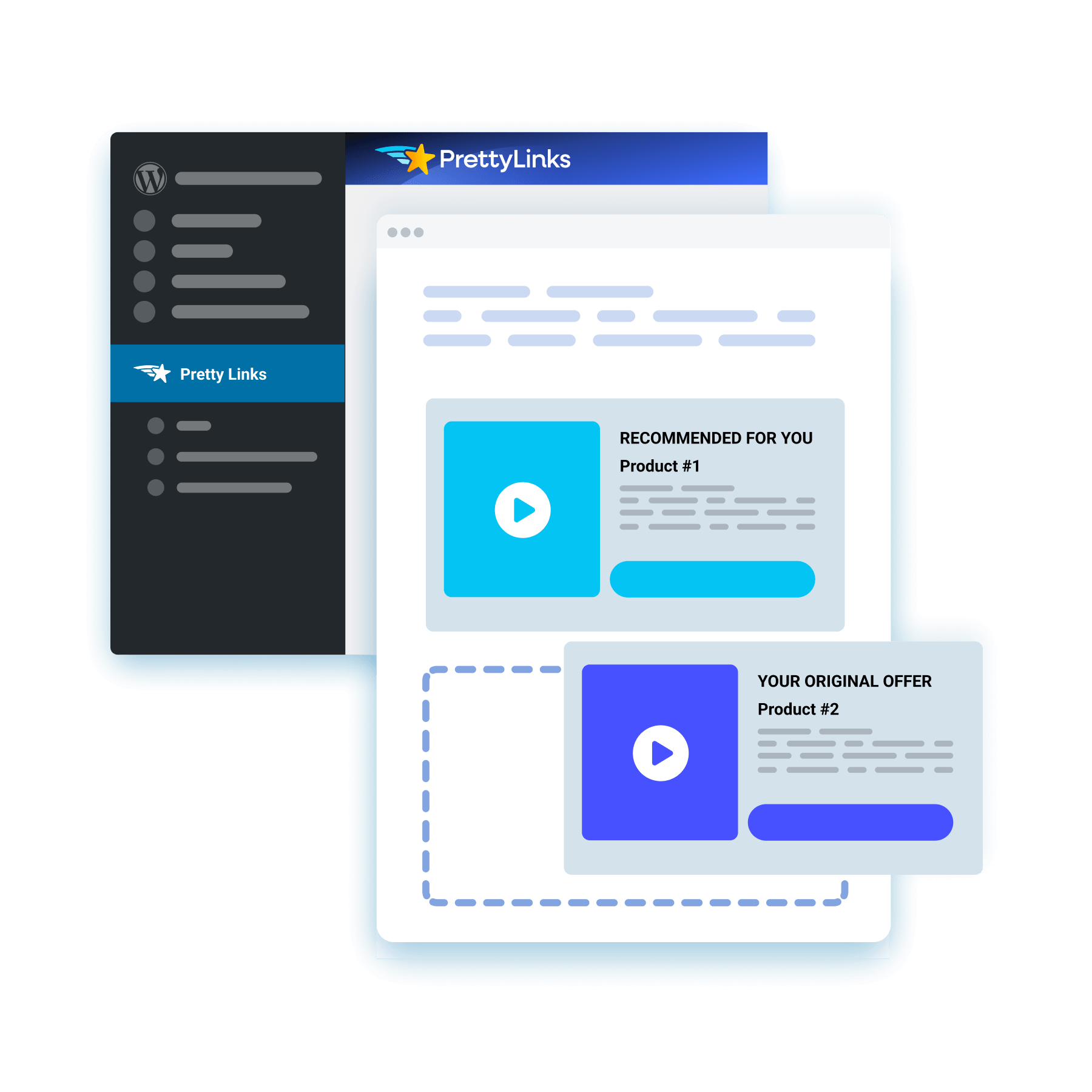
Start with a template, paste in your copy, add an image or video, and place up to two CTA buttons for a splash page built entirely within your PrettyLinks dashboard — no designer or third-party tool required.
Lead With Your Best Lead Magnet
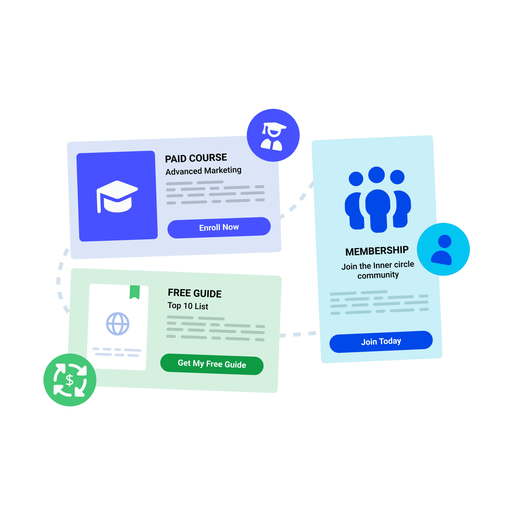
Use a splash page to share your offers first, whether that’s a free guide, a paid course, or a membership sign-up. Visitors act on their way through and become a new sign-up, student, or recurring revenue stream.
Add a Second Commission to the Click
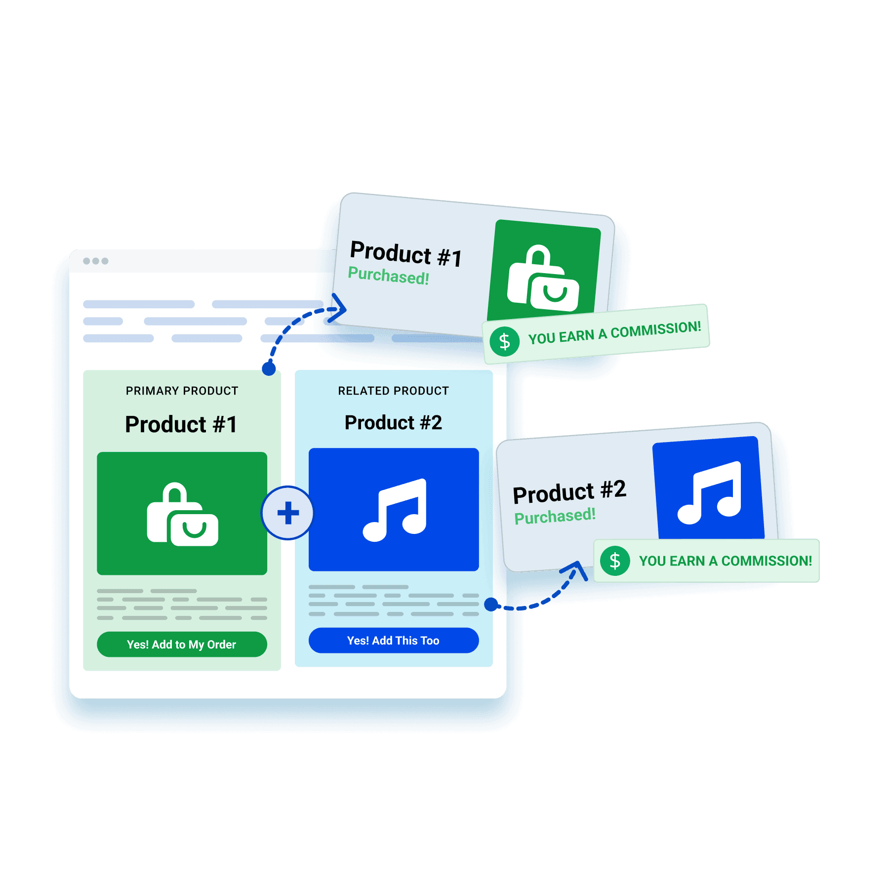
Promote a related product, a bundle, or a tempting upgrade with a splash page. One click suddenly puts multiple affiliate offers on your audience’s mind — doubling what they might buy and what you stand to earn.
Get Paid to Run Someone Else’s Ad
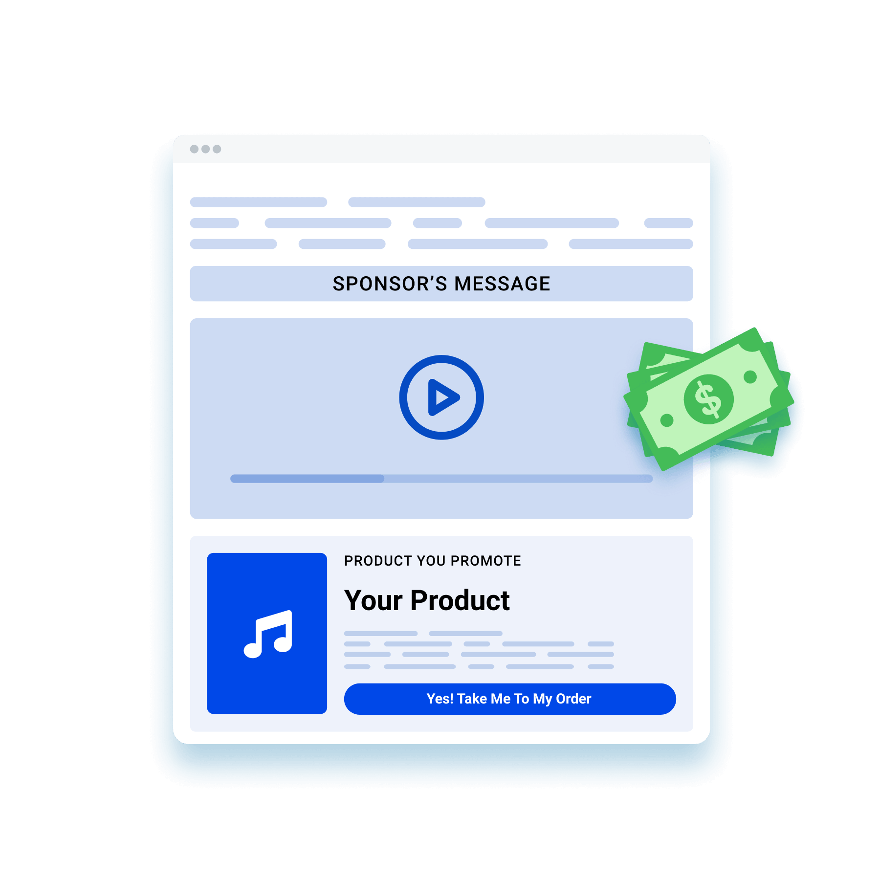
Give a sponsor’s image or video a spot to play on your splash page while visitors are en route to your offer. Now that same traffic starts earning ad revenue on top of the commission you’re already chasing.
A Fresh Way to Stay FTC-Compliant
Post your affiliate disclosure on a splash page of its own for something a little different than the usual line of fine print. The added transparency earns your audience’s trust while keeping you in line with FTC guidelines and program rules.

Hold Their Attention Until They Act
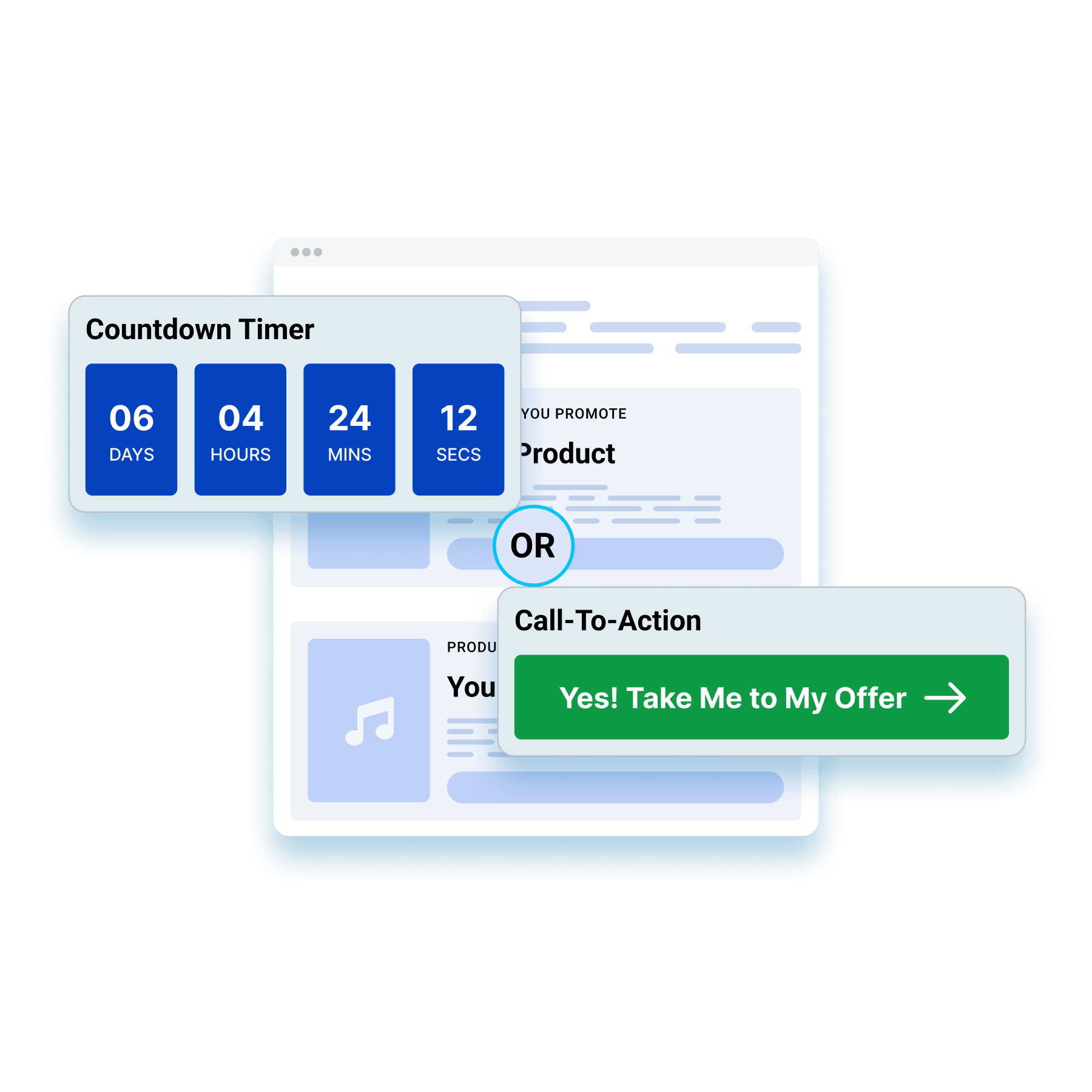
Set a countdown that redirects visitors automatically, or skip the timer and let a CTA be their way forward. Both keep eyes on the splash page longer, giving your offer more time to win your audience over.
Capture Every Step Your Visitors Take
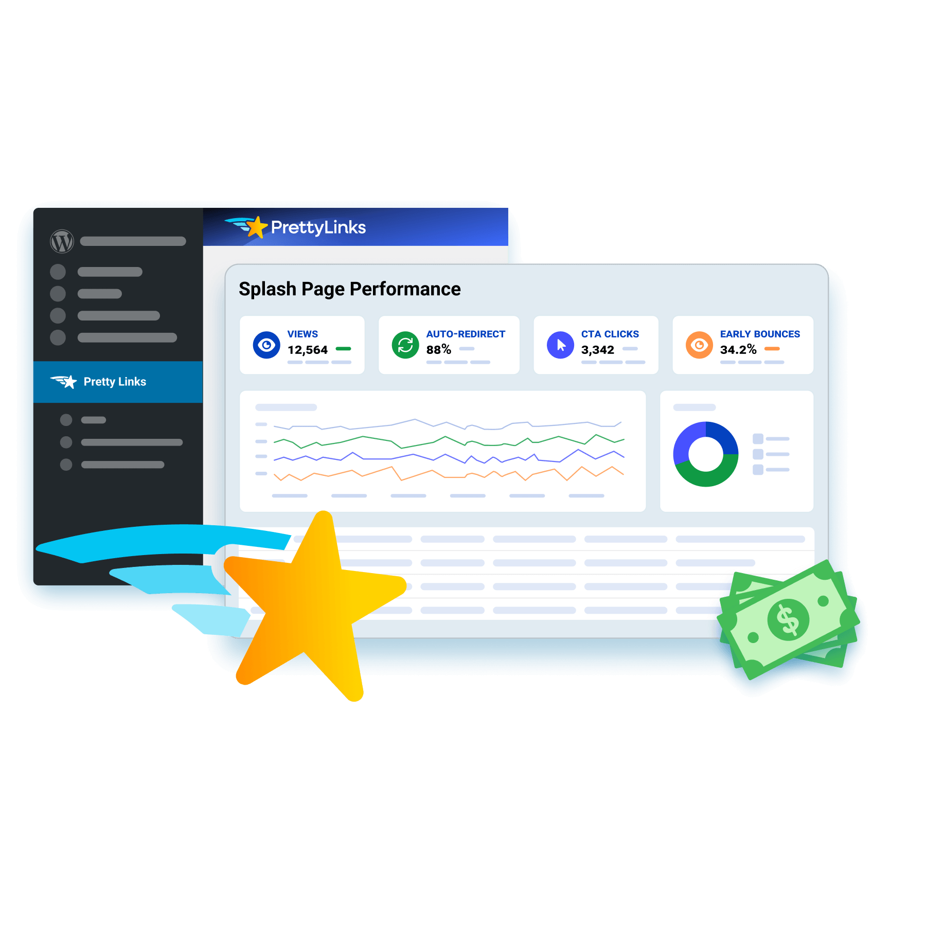
Each splash page saves its own funnel performance, tracking views, auto-redirect rate, CTA clicks, and bounce rate, so your page data and link metrics come together to show the full path a visitor takes.
Frequently Asked Questions
Answers on what a splash page is, how it compares to a landing page, what to put on one, and how to set the redirect timer in PrettyLinks.
A splash page is a short stop between a click and its destination. Someone taps your pretty link, sees one message and a button or two, then continues where they were headed.
It’s the moment you get to say one thing before handing a visitor off, which makes it useful for anything that needs to land before the click finishes: flag your affiliate disclosure, share a discount code they’ll need at checkout, point them to your full review first, or let them pick which offer they’re actually after.
Our PrettyLinks Splash Pages article breaks down what affiliates are doing with the few seconds most people throw away.
A landing page is built to hold someone’s attention. A splash page is built to hand it off.
Landing pages carry longer sections of copy, testimonials, and a full pitch, because closing the sale is the whole job. Splash pages carry one message and a button, because your visitor is already on their way somewhere and you’re borrowing a few seconds of the trip.
They’re not competing for the same slot. The landing page does the selling. The splash page handles whatever has to happen first.
Read our PrettyLinks Splash Pages article to learn more about how splash pages compare to landing pages, homepages, and popups.
Not much, and that’s on purpose. The five things that should go on a Splash page include: a header, supporting body copy, an image or a video, one or two CTA buttons, and a countdown timer.
You’ve got about three seconds before someone starts looking for the exit, so every element has to earn its place. Push them closer to buying or hand them something genuinely better to do — anything else is just delay.
Want to see it done right? Our 12 Splash Page Examples article is full of designs worth stealing.
Yes. Just drop in a YouTube, Vimeo, or Wistia URL and it’ll play on your splash page before anyone reaches the destination.
It’s the closest thing to a warm introduction an affiliate link can get. A quick demo of the tool you’re recommending, your own walkthrough of the product, or a thirty-second pitch — whatever helps someone arrive already sold instead of arriving cold.
And if the video’s the main event, pair it with the Bold template. It’s built around a large media area, so your video gets the screen rather than fighting a wall of text for it.
Our Creating a Splash Link doc walks you through adding media to your splash page.
Yes, anywhere from 3 to 60 seconds. The default is 10, and most people dial it down from there.
Three to five seconds is the sweet spot for a disclosure or a quick handoff — long enough to be read, short enough that nobody feels held hostage. Save the longer end for when the splash page itself is the point, like a video someone actually needs to watch.
You can also skip the auto-redirect entirely and let your CTA buttons do the work, which is the move when you’re giving people a choice rather than moving them along.
Our Creating a Splash Link doc covers the countdown settings on every splash link you build.
Yes, that’s what the second CTA button is for. Two buttons pointing at two different pretty links, so one splash page can encourage two completely different actions. That matters because not everyone who clicks your link is at the same place.
Some are ready to buy, and the first button sends them straight to the offer. Others are still weighing it up, and rather than pushing them toward a purchase they’re not ready for, the second button hands them your full review so they can keep reading until they are.
Our Splash Funnel Report doc shows you how to set up reporting on your splash links, so you can see which button readers are choosing and how many make it through to the offer.