
Configurez votre site pour générer des conversions en quelques clics seulement
Commencez par choisir un modèle, collez votre texte, ajoutez une image ou une vidéo, puis insérez jusqu’à deux boutons d’appel à l’action pour créer une page d’accueil entièrement dans votre tableau de bord PrettyLinks — sans avoir besoin d’un graphiste ni d’un outil tiers.
Commencez par votre meilleur « lead magnet »
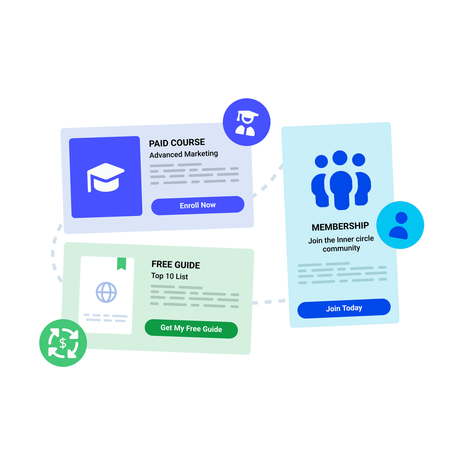
Utilisez une page d'accueil pour présenter vos offres en premier lieu, qu'il s'agisse d'un guide gratuit, d'une formation payante ou d'une inscription à un abonnement. Les visiteurs réagissent au fur et à mesure de leur navigation et deviennent ainsi de nouveaux inscrits, des étudiants ou une source de revenus récurrents.
Ajouter une deuxième commission au clic
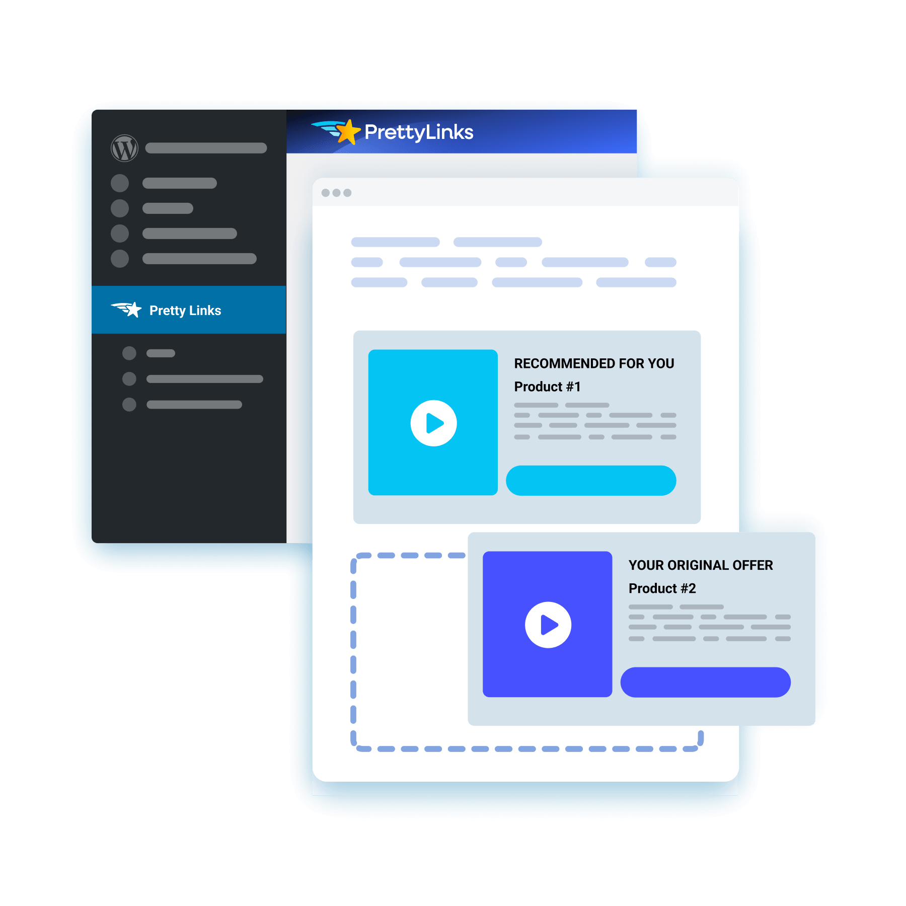
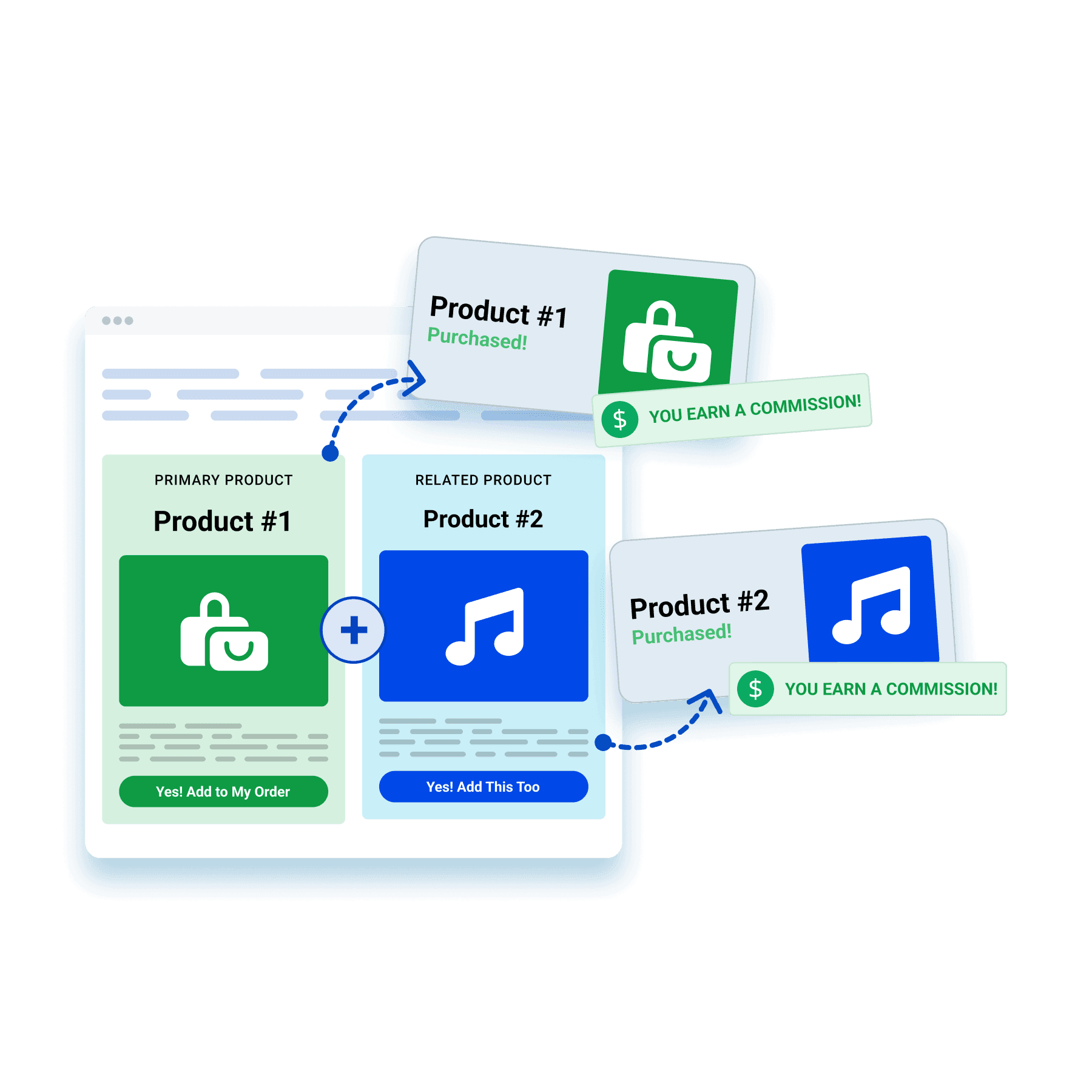
Mettez en avant un produit associé, une offre groupée ou une mise à niveau alléchante à l'aide d'une page d'accueil. En un seul clic, vous attirez l'attention de votre public sur plusieurs offres d'affiliation, ce qui double à la fois le nombre d'achats potentiels et vos gains potentiels.
Gagnez de l'argent en diffusant les publicités de tiers
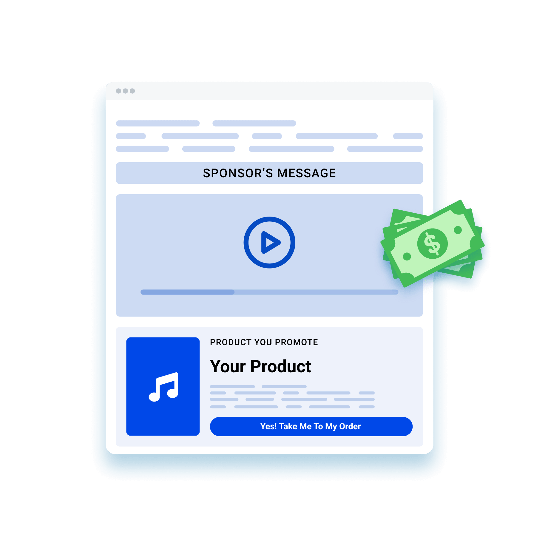
Proposez un espace sur votre page d'accueil pour diffuser l'image ou la vidéo d'un partenaire pendant que les visiteurs accèdent à votre offre. Ce même trafic commence alors à générer des revenus publicitaires en plus de la commission que vous percevez déjà.
Une nouvelle façon de rester en conformité avec les règles de la FTC
Publiez votre déclaration d'affiliation sur une page d'accueil dédiée, pour vous démarquer un peu des mentions légales habituelles en petits caractères. Cette transparence accrue vous permettra de gagner la confiance de votre public tout en respectant les directives de la FTC et les règles du programme.

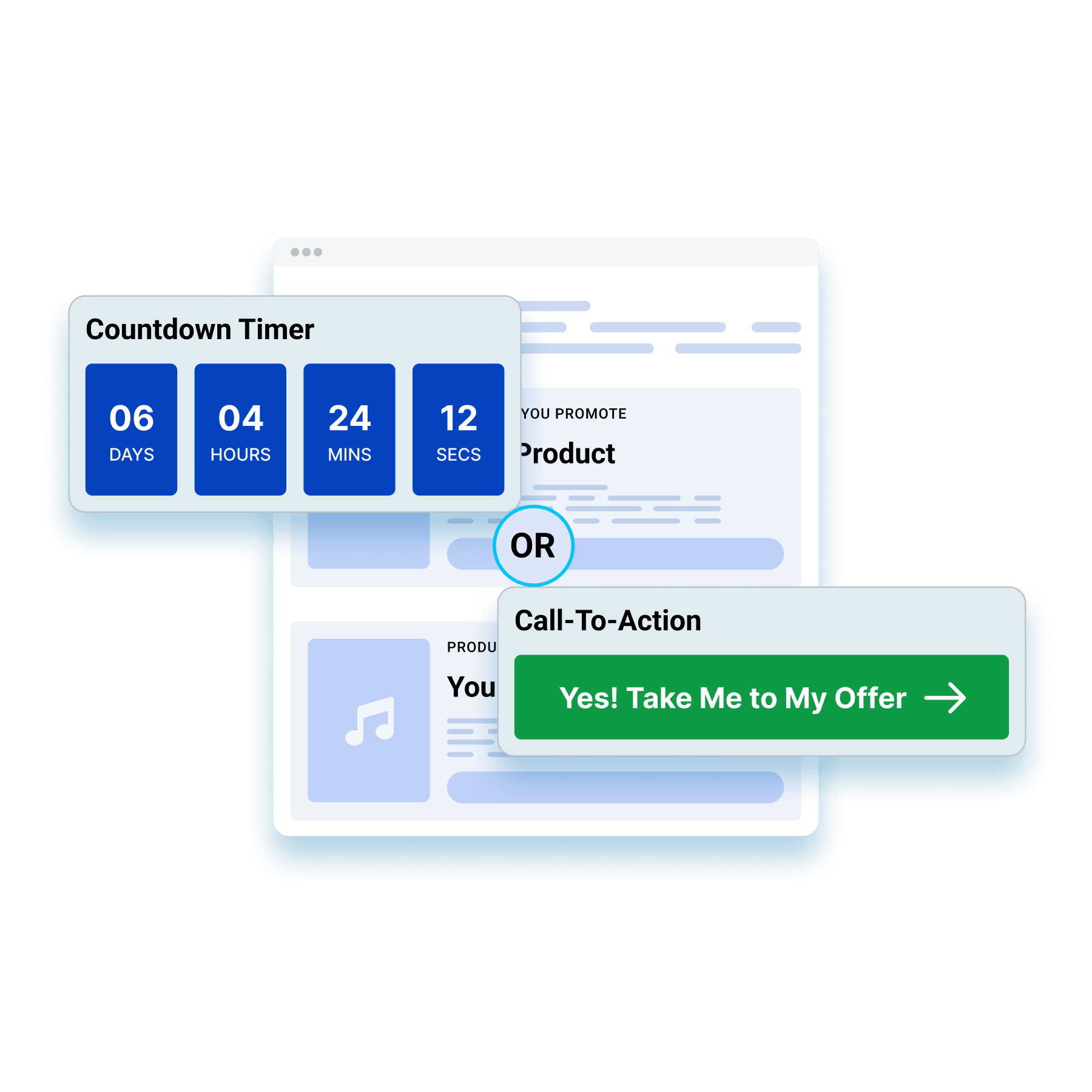
Captez leur attention jusqu’à ce qu’ils passent à l’action
Configurez un compte à rebours qui redirige automatiquement les visiteurs, ou faites l'impasse sur le compte à rebours et laissez un appel à l'action (CTA) guider leur parcours. Ces deux méthodes permettent de retenir plus longtemps l'attention des visiteurs sur la page d'accueil, ce qui donne à votre offre davantage de temps pour convaincre votre public.
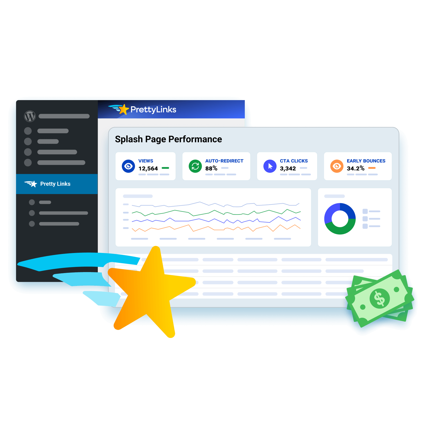
Suivez chacun des pas de vos visiteurs
Chaque page d'accueil enregistre ses propres performances en termes d'entonnoir de conversion, en suivant le nombre de vues, le taux de redirection automatique, les clics sur les appels à l'action (CTA) et le taux de rebond. Ainsi, les données de votre page et les indicateurs liés aux liens s'associent pour retracer l'intégralité du parcours d'un visiteur.
Questions fréquemment posées
Answers on what a splash page is, how it compares to a landing page, what to put on one, and how to set the redirect timer in PrettyLinks.
A splash page is a short stop between a click and its destination. Someone taps your pretty link, sees one message and a button or two, then continues where they were headed.
It’s the moment you get to say one thing before handing a visitor off, which makes it useful for anything that needs to land before the click finishes: flag your affiliate disclosure, share a discount code they’ll need at checkout, point them to your full review first, or let them pick which offer they’re actually after.
Notre PrettyLinks Splash Pages article breaks down what affiliates are doing with the few seconds most people throw away.
A landing page is built to hold someone’s attention. A splash page is built to hand it off.
Landing pages carry longer sections of copy, testimonials, and a full pitch, because closing the sale is the whole job. Splash pages carry one message and a button, because your visitor is already on their way somewhere and you’re borrowing a few seconds of the trip.
They’re not competing for the same slot. The landing page does the selling. The splash page handles whatever has to happen first.
Read our PrettyLinks Splash Pages article to learn more about how splash pages compare to landing pages, homepages, and popups.
Not much, and that’s on purpose. The five things that should go on a Splash page include: a header, supporting body copy, an image or a video, one or two CTA buttons, and a countdown timer.
You’ve got about three seconds before someone starts looking for the exit, so every element has to earn its place. Push them closer to buying or hand them something genuinely better to do — anything else is just delay.
Want to see it done right? Our 12 Splash Page Examples article is full of designs worth stealing.
Yes. Just drop in a YouTube, Vimeo, or Wistia URL and it’ll play on your splash page before anyone reaches the destination.
It’s the closest thing to a warm introduction an affiliate link can get. A quick demo of the tool you’re recommending, your own walkthrough of the product, or a thirty-second pitch — whatever helps someone arrive already sold instead of arriving cold.
And if the video’s the main event, pair it with the Bold template. It’s built around a large media area, so your video gets the screen rather than fighting a wall of text for it.
Notre Creating a Splash Link doc walks you through adding media to your splash page.
Yes, anywhere from 3 to 60 seconds. The default is 10, and most people dial it down from there.
Three to five seconds is the sweet spot for a disclosure or a quick handoff — long enough to be read, short enough that nobody feels held hostage. Save the longer end for when the splash page itself is the point, like a video someone actually needs to watch.
You can also skip the auto-redirect entirely and let your CTA buttons do the work, which is the move when you’re giving people a choice rather than moving them along.
Notre Creating a Splash Link doc covers the countdown settings on every splash link you build.
Yes, that’s what the second CTA button is for. Two buttons pointing at two different pretty links, so one splash page can encourage two completely different actions. That matters because not everyone who clicks your link is at the same place.
Some are ready to buy, and the first button sends them straight to the offer. Others are still weighing it up, and rather than pushing them toward a purchase they’re not ready for, the second button hands them your full review so they can keep reading until they are.
Notre Splash Funnel Report doc shows you how to set up reporting on your splash links, so you can see which button readers are choosing and how many make it through to the offer.