
Available on the Super Affiliate plan.
Product Displays ships with six built-in themes. Each one is a complete visual style — borders, shadows, button shapes, padding, typography. You pick the theme at the group level, and individual products can override it if you want a single card to stand out.
This guide is part of the Pretty Links Product Displays, the entry point for the Product Displays add-on.
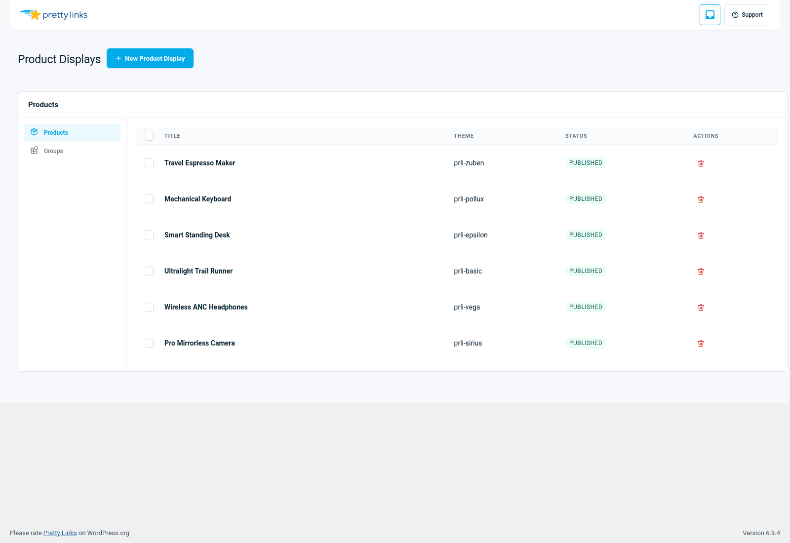
The Six Themes
Basic
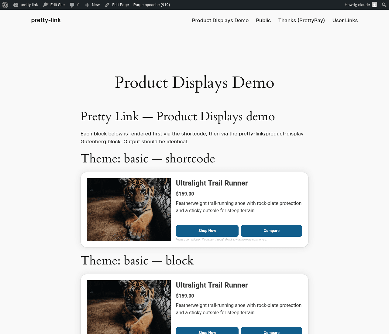
Clean, minimal, technical. Crisp borders, simple typography, no decoration. Reads as serious and trustworthy — the kind of card you’d expect on a SaaS comparison page or a developer tools roundup.
Best for: B2B comparisons, technical product lists, no-frills affiliate roundups.
Sirius
Bright, modern, slightly playful. More white space, softer corners, light shadows. A neutral middle ground between Basic and the more decorative themes.
Best for: Lifestyle blogs, general affiliate roundups, “tools I love” pages where you want polish without going elaborate.
Pollux
Editorial. Larger imagery, more refined typography, magazine-style proportions. Reads like a curated review section in a print magazine.
Best for: Long-form review sites, premium product roundups, anywhere you want the cards to feel like editorial recommendations.
Vega
Bold and high-contrast. Strong color blocks, prominent CTAs, high visual energy. The theme that fights hardest for attention.
Best for: Promotional roundups, sale pages, gift guides, time-sensitive content where you need to drive action.
Epsilon
Compact and information-dense. Smaller image area, more room for description text and feature bullets. Good when the information matters more than the visual.
Best for: Pricing tier comparisons, feature-rich SaaS roundups, technical product specs.
Zuben
Card-forward and visual. Big image, minimal chrome, almost catalog-like. The theme that lets the product photography do the talking.
Best for: Visual products (fashion, food, gear), Instagram-driven traffic, brands with strong photography.
Mixing Themes
You’re not locked into one theme per site. A few common approaches:
One theme per group, picked by category. Use Basic for tools, Pollux for books, Zuben for gear. Each roundup post inherits the right look automatically.
Override one product in a group. Most products use the group’s theme, but you single out the “premium pick” with a more elaborate theme so it reads as the recommended option.
Match the post’s tone. A serious comparison post uses Basic; a holiday gift guide uses Vega; a long editorial review uses Pollux.
There’s no “wrong” combination, but pages tend to read more cohesively when the visual energy of the theme matches the editorial energy of the post around it.
How to Switch a Theme
In the group editor, change the theme dropdown and save. Every post or page that displays this group instantly updates to the new theme. No re-publishing required.
To override the theme on a single product (within a group that uses a different theme), open the product, change its theme field, and save.
Comparison at a Glance
| Theme | Visual energy | Density | Best fit |
|---|---|---|---|
| Basic | Low | Medium | Technical/B2B comparisons |
| Sirius | Medium | Medium | General lifestyle and affiliate |
| Pollux | Medium-high | Low | Editorial, premium reviews |
| Vega | High | Medium | Sales, gift guides, promos |
| Epsilon | Medium | High | Feature-rich SaaS comparisons |
| Zuben | High | Low | Visual products, gear, food |
Choosing Without Overthinking It
If you can’t decide, start with Sirius. It’s a strong neutral default that works on almost any site. You can always switch later, and because the theme lives at the group level, changing it is a one-click operation that updates everywhere automatically.