
Verfügbar im „Super Affiliate“-Tarif.
„Product Displays“ wird mit sechs integrierten Designs ausgeliefert. Jedes davon ist ein vollständiger visueller Stil – Rahmen, Schatten, Schaltflächenformen, Abstände, Typografie. Sie wählen das Design auf Gruppenebene aus, und einzelne Produkte können dieses überschreiben, wenn Sie möchten, dass eine bestimmte Karte besonders hervorsticht.
Dieser Leitfaden ist Teil der Pretty Links Produktanzeigen, der Einstiegspunkt für das Add-on „Product Displays“.
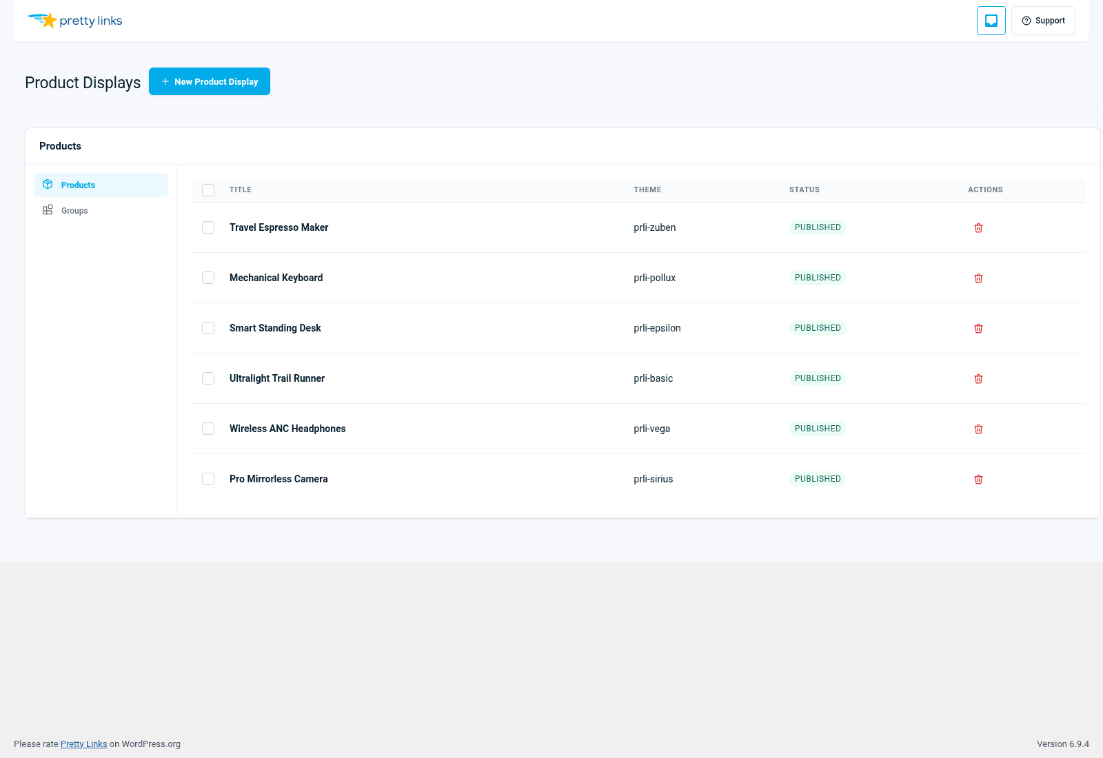
Die sechs Themen
Grundlegend
Schlicht, minimalistisch, technisch. Klare Konturen, schlichte Typografie, keine Verzierungen. Wirkt seriös und vertrauenswürdig – genau die Art von Karte, die man auf einer SaaS-Vergleichsseite oder in einer Übersicht über Entwicklertools erwarten würde.
Am besten geeignet für: B2B-Vergleiche, technische Produktlisten, schnörkellose Affiliate-Übersichten.
Sirius
Hell, modern, ein wenig verspielt. Mehr Weißraum, weichere Ecken, sanfte Schatten. Ein neutraler Mittelweg zwischen „Basic“ und den eher dekorativen Designs.
Am besten geeignet für: Lifestyle-Blogs, allgemeine Affiliate-Übersichten, Seiten mit dem Titel “Tools, die ich liebe”, bei denen es auf einen gepflegten Eindruck ankommt, ohne dass es zu aufwendig sein soll.
Pollux
Leitartikel. Größere Bilder, raffiniertere Typografie, Proportionen im Magazinstil. Liest sich wie ein sorgfältig zusammengestellter Rezensionsteil in einem Printmagazin.
Am besten geeignet für: Websites mit ausführlichen Testberichten, Premium-Produktübersichten – überall dort, wo die Karten wie redaktionelle Empfehlungen wirken sollen.
Vega
Kühn und kontrastreich. Kräftige Farbblöcke, auffällige Handlungsaufforderungen, hohe visuelle Dynamik. Das Theme, das am stärksten um Aufmerksamkeit buhlt.
Am besten geeignet für: Aktionsübersichten, Angebotsseiten, Geschenkideen, zeitkritische Inhalte, bei denen Sie zum Handeln anregen müssen.
Epsilon
Kompakt und informationsreich. Kleinerer Bildbereich, mehr Platz für Beschreibungstext und Aufzählungspunkte zu den Funktionen. Gut geeignet, wenn die Informationen ist wichtiger als das Visuelle.
Am besten geeignet für: Vergleiche verschiedener Preisstufen, Übersichten über funktionsreiche SaaS-Lösungen, technische Produktspezifikationen.
Zuben
Kartenorientiert und visuell. Große Bilder, wenig Chrom, fast wie in einem Katalog. Ein Design, bei dem die Produktfotos für sich sprechen.
Am besten geeignet für: Visuelle Produkte (Mode, Lebensmittel, Ausrüstung), durch Instagram generierter Traffic, Marken mit überzeugender Fotografie.
Themen mischen
Sie sind nicht auf ein Thema pro Website festgelegt. Hier einige gängige Ansätze:
Ein Thema pro Gruppe, ausgewählt nach Kategorie. Verwende „Basic“ für Werkzeuge, „Pollux“ für Bücher und „Zuben“ für Ausrüstung. Jeder Zusammenfassungsbeitrag erhält automatisch das passende Design.
Ein Produkt in einer Gruppe überschreiben. Die meisten Produkte greifen das Thema der Gruppe auf, aber Sie heben die “Premium-Auswahl” durch ein aufwendigeres Thema hervor, sodass sie als empfohlene Option erkennbar ist.
Passe dich dem Ton des Beitrags an. Ein fundierter Vergleichsbeitrag nutzt „Basic“, ein Ratgeber für Weihnachtsgeschenke nutzt „Vega“ und eine ausführliche redaktionelle Rezension nutzt „Pollux“.
Es gibt zwar keine “falsche” Kombination, doch Seiten wirken in der Regel stimmiger, wenn die visuelle Ausstrahlung des Themes zu der Leitartikel Energie des Pfostens in seiner Umgebung.
So wechseln Sie ein Design
Ändern Sie im Gruppeneditor die Auswahl im Dropdown-Menü „Design“ und speichern Sie die Änderung. Jeder Beitrag oder jede Seite, auf der diese Gruppe angezeigt wird, wird sofort auf das neue Design umgestellt. Eine erneute Veröffentlichung ist nicht erforderlich.
Um das Design für ein einzelnes Produkt (innerhalb einer Gruppe, die ein anderes Design verwendet) zu überschreiben, öffnen Sie das Produkt, ändern Sie das Feld „Design“ und speichern Sie die Änderung.
Vergleich auf einen Blick
| Thema | Visuelle Energie | Dichte | Optimale Passform |
|---|---|---|---|
| Grundlegend | Niedrig | Mittel | Technische/B2B-Vergleiche |
| Sirius | Mittel | Mittel | Allgemeiner Lifestyle und Affiliate-Marketing |
| Pollux | Mittel bis hoch | Niedrig | Leitartikel, Premium-Rezensionen |
| Vega | Hoch | Mittel | Sonderangebote, Geschenkideen, Werbeaktionen |
| Epsilon | Mittel | Hoch | SaaS-Vergleiche mit umfangreichen Funktionen |
| Zuben | Hoch | Niedrig | Visuelle Produkte, Ausrüstung, Lebensmittel |
Entscheiden, ohne zu viel darüber nachzudenken
Wenn Sie sich nicht entscheiden können, fangen Sie mit „Sirius“ an. Das ist ein solides, neutrales Standard-Theme, das auf fast jeder Website funktioniert. Sie können später jederzeit wechseln, und da das Theme auf Gruppenebene verwaltet wird, ist die Änderung mit einem einzigen Klick erledigt und wird automatisch überall aktualisiert.