
Available on the Super Affiliate plan.
Splash Pages ship with four templates. Each is a complete visual style — layout, color, type, button shape. You pick the template per link, so different splash pages on the same site can use different templates depending on what fits.
Modern
A centered card on a dark background. Clean typography, soft shadows, plenty of whitespace. Reads as polished and trustworthy.
Visual feel: Premium, app-like, modern SaaS.
Best for: Course launches, premium product previews, branded handoffs to high-end partners, anything where you want the splash to feel like part of a polished funnel.
Bold
A hero band that fills the screen. Big heading, large media area, full-width buttons. High visual energy.
Visual feel: Loud, confident, attention-grabbing.
Best for: Sale announcements, time-sensitive promos, video gates where the video is the focal point, video sales letter intros.
Minimal
Tight, bordered card with very little decoration. Reads almost like an alert dialog.
Visual feel: Plain, neutral, low-pressure.
Best for: Affiliate disclosures, “you’re leaving the site” notices, anywhere the goal is to communicate clearly without selling. The minimal style signals “this is a real notice, not a sales tactic.”
Classic
Typography-only. No card, no border, no decoration. Just heading, subheading, optional media, and buttons on a clean background.
Visual feel: Editorial, calm, no-nonsense.
Best for: Text-heavy splash pages, “choose your guide” menus, anything where the words are the point and you don’t want visual chrome competing with them.
Comparison Table
| Template | Visual energy | Layout | Best for |
|---|---|---|---|
| Modern | Medium | Centered card, dark | Course launches, premium SaaS, polished funnels |
| Bold | High | Full hero band | Promos, video gates, sales-driven moments |
| Minimal | Low | Tight bordered card | Affiliate disclosure, leave-site notices |
| Classic | Low-medium | Typography-only | Choose-your-destination, editorial, text-heavy pages |
Picking a Template by Intent
Different intents fit different templates:
- “I need to disclose an affiliate relationship.” → Minimal. The understated style is right for a regulatory notice;
- “I want visitors to watch this video.” → Bold. The video deserves the most visual real estate;
- “This is a premium course launch.” → Modern. The polish matches the brand promise;
- “I’m asking visitors to choose a path.” → Classic. The typographic style keeps the focus on the words and the buttons;
- “I’m announcing a flash sale.” → Bold. Match the energy;
- “I’m handing off to a partner site.” → Modern or Minimal, depending on whether the brand is premium or institutional.
Switching Templates
You can change the template on any splash link at any time. Open the link, change the template field in the Splash tab, save. The new look takes effect immediately. Your heading, subheading, media, CTAs, and behavior settings all carry over — only the visual style changes.
This makes A/B testing template choice straightforward: ship with one template for a week, switch to another, and compare conversion rates in the funnel report. See Splash Funnel Report.
A Consistent Strategy Across Links
Many sites end up using two or three templates as defaults:
- Minimal for all affiliate disclosure splashes;
- Modern for branded course/product launches;
- Bold for promotional moments.
Picking a default per use case saves you from re-deciding each time and gives your site visual consistency across hundreds of splash links.
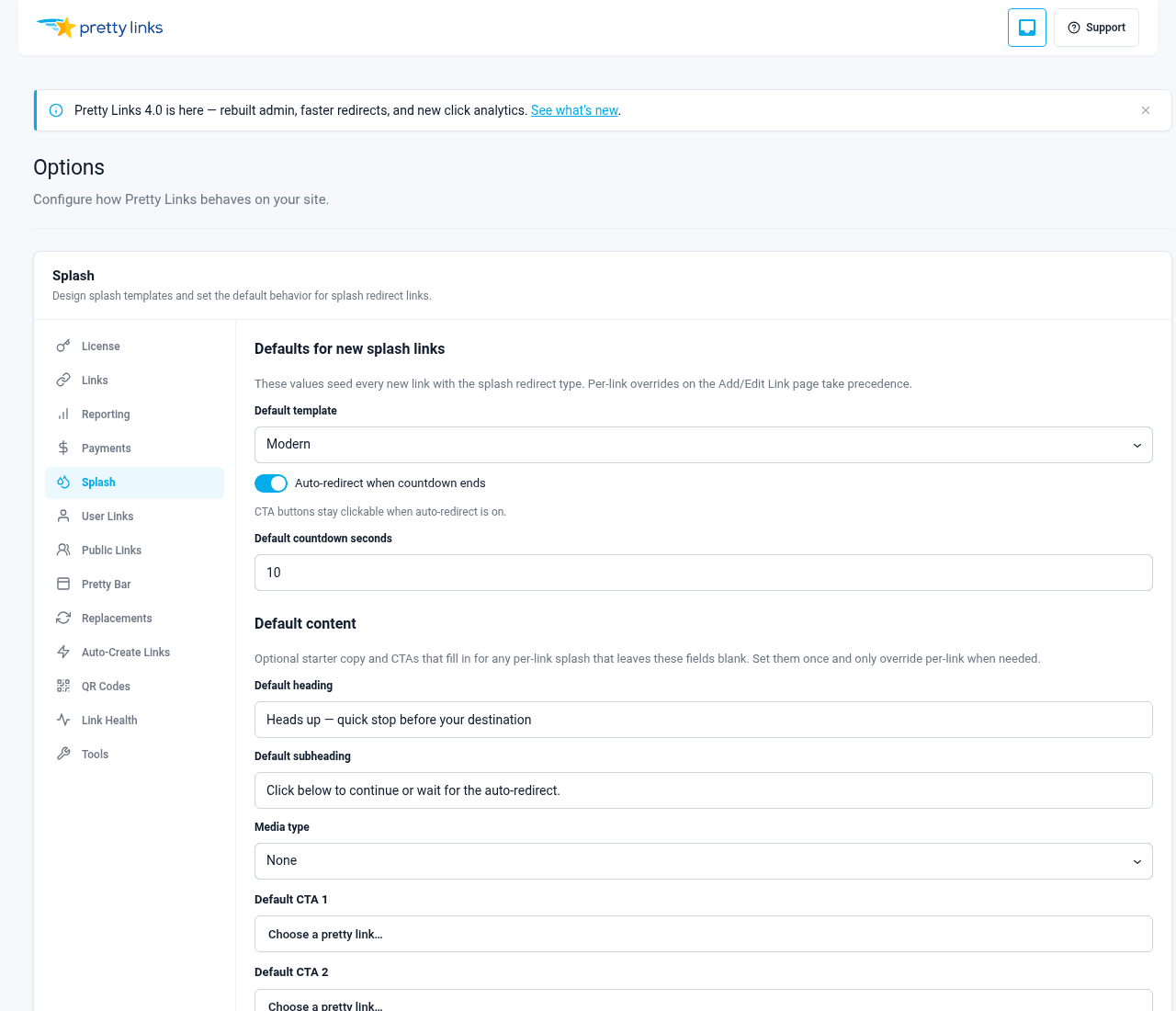
The Global Splash Defaults page lets you set one template as the site-wide default for new splash links — useful once you’ve found the template you reach for most often.