3 Ways to Improve Your Website’s Accessibility

Contents
Today, more than a billion people experience some kind of disability. This can make navigating certain websites difficult, especially when they include dynamic features. As a result, it’s vital that we all strive to create websites that are completely accessible.
Web accessibility is the practice of making sure there are no barriers that might prevent interaction with or access to your site. This can be as simple as adding ‘alt text' to all the images you upload, or ensuring that you always use ‘semantic HTML' (we'll explain both of these terms later on).
In this post, we'll talk more about why accessibility is so important. We’ll then explore some of the ways you can improve your site's accessibility for all visitors. Let’s get to it!
Why Accessibility Is Essential for Any Website
From its very beginning, the internet was intended to be used by everyone – no matter their software, location, language, or ability. In fact, Tim Berners-Lee, the man credited with the web’s creation, said that: “The power of the Web is in its universality – access by everyone regardless of disability is an essential aspect.”
Although the internet has changed a lot since that time, the original goal set by Berners-Lee still stands. It is essential for any site you create to be completely accessible to all visitors, regardless of their abilities.
When a web page meets this goal, the impact of disability on the visitor's experience is lessened. This is vital, since the web removes barriers to communication and interaction that many people often face in the physical world. When you ignore this goal, you risk creating new barriers that exclude certain people from your site.
What's more, a fully-accessible site doesn’t just help those with disabilities. There are other types of visitors this can benefit, including:
- Those who have physical injuries, such as a broken arm or hand.
- Older people, who have changing abilities due to aging.
- People with ‘situational limitations’ – such as being in an environment where they can’t listen to audio.
Keeping the individual needs of each person in mind would make creating a website incredibly difficult. Fortunately, there are a lot of resources that can help. The Web Accessibility Initiative (WAI), for example, offers a handy list of Web Accessibility Guidelines that make for a strong starting point.
3 Ways to Improve Your Website’s Accessibility
Even so, you may be unsure how to adapt and adjust certain elements of your site to make them more universally accessible. To get you started, let's explore three of the most simple (yet effective) changes you can make.
1. Add ‘Alt Text' to Your Site’s Images
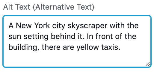
When uploading images to your website, it’s likely you’ve come across the option to add ‘alternative text’ or ‘alt text'. This is text that will be displayed if the image fails to load. In addition, this text is also used when a visitor navigates your site using a screen reader, or a similar assistive device.
For these reasons, it’s important not to skip over adding alt text to your images. To do so, describe the image in as much detail as possible – including distinguishable elements, and the names of any locations. This will enable those who can't see the image to understand its relevance:

There are a number of other guidelines for creating the perfect alt text, although keeping it under 125 characters is a good start. Anything longer could be cut off by assistive devices, making it more difficult to read.
2. Ensure That You Always Use Semantic HTML
You’d be forgiven for thinking that the HTML used to code your website has little to do with accessibility. In reality, it plays a huge role in how easy your pages are to read.
‘Semantic HTML' refers to clean coding that clearly defines each section of your site in chronological order:

As we’ve already mentioned, many users with disabilities rely on screen readers to navigate websites. When this type of assistive device scans a web page, it collects information based on the page's HTML structure. Unclear or messy HTML code with unnecessary additions will be more difficult for the screen reader to make sense of.
If you want to improve your semantic coding skills, there are plenty of learning resources available online. W3 Schools is an excellent example. This free site will teach you just about everything you need to know – and even includes a lesson specifically based around improving accessibility through HTML.
3. Choose the Colors You'll Use Carefully
The term ‘color blindness‘ is often used in an off-the-cuff manner. However, color-related visual impairments can present a serious issue – especially for those trying to navigate certain websites.
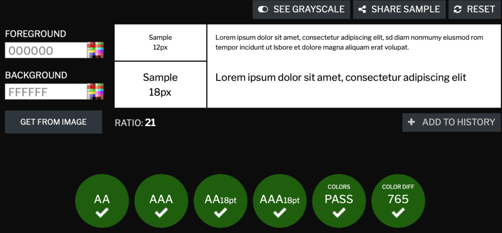
With that in mind, you'll want to make sure that the colors you select for your site contrast well. The simplest way to do that is by making sure all text stands out against your chosen background. So you’ll need to avoid using clashing colors, or shades that are similar.
The ideal combination is dark text against a light-colored background, as this is the easiest to read:

If you’re unsure what colors to use, there are plenty of online tools you can use to test suitable combinations. WebAIM is an easy-to-use option, while Contrast Checker offers the additional benefit of a real-time accessibility score.
Conclusion
Without accessibility, the web will never fulfill its original purpose. It’s essential that your site can be fully navigated by all users, regardless of their abilities. Failing to design your pages with accessibility in mind will only serve to alienate potential users.
In this post, we highlighted three of the ways you can easily improve the level of accessibility on your site:
- Ensure that you always add alt text to images and other media.
- Use semantic HTML for your site's code.
- Make sure the colors you use are easily readable.
Do you have any further questions about web accessibility? Let us know in the comments section below!