How to Choose the Right Color Scheme for Your Blog
Contents
When you run a blog, choosing the right color scheme for your site can be crucial. A complementary color scheme can draw users in, while choosing one that is dull or overwhelming may cause visitors to leave your site instead.
Fortunately, picking out a harmonious set of colors for your blog isn't that hard. You'll just need to know what to consider along the way. That includes researching which colors your target demographics are likely to prefer, and learning about the basics of accessibility.
In this article, we'll discuss some of the things you’ll want to keep in mind when picking out your blog’s primary colors. Let’s get going!
A Brief Introduction to Color Schemes
Before we dive into choosing your own scheme, let’s start with a quick introduction to color theory. Color theory is the field concerned with how different shades work in combination, and the impact they have on people.
It’s important to be careful when designing your website’s color scheme. The wrong hues can have a negative impact on your blog, without you even realizing it. For example, too many bright or contrasting colors may overwhelm the senses, and leave visitors feeling confused about what they’re supposed to look at.
Color theory can help you strike the right balance, primarily through the concept of ‘color schemes'. A color scheme is the set of hues you use together in a particular design. They can be picked out based on your personal preference, or chosen on a color wheel. Even if you aren’t familiar with color theory, you've probably seen a color wheel before:
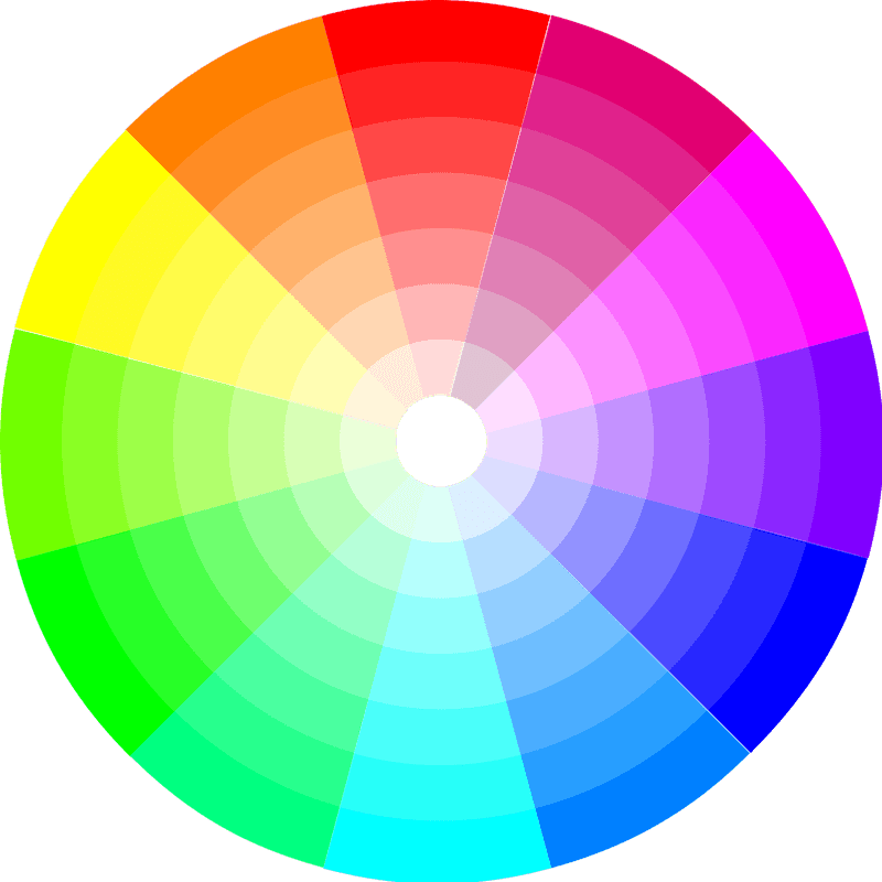
The best color schemes often involve selecting a combination of colors based on their positions on the color wheel. For example, complementary schemes sit directly opposite from one another. This creates strong, striking contrast (for example, orange and blue).
Some other common types of color schemes include:
- Monochromatic. A monochromatic color scheme uses a single hue in lighter and darker shades.
- Analogous. This type of color scheme uses three colors that are next to each other on the color wheel. You pick a primary color, and then two supplementary colors that are the same number of degrees away from it to the left and right. You can increase and decrease the distance for various effects.
- Split-complementary. This is an analogous color scheme with a complementary color added into the mix. The complementary color is chosen based on the primary color. This enable you to use the strong contrast of complementary colors but achieve a less overwhelming effect, since the analogous colors soften the look.
- Dual color scheme. A dual, or tetradic, color scheme uses two complementary color pairs. You must be careful when using this: all four colors will have equal dominance, which can make it hard for viewers to know what to focus on. This scheme is best used when you have a lot of distinct content that you want the viewer to pay equal attention to.
As you can see, each of these schemes produces different effects. That's why your blog's color scheme should be carefully chosen, based on the type of market you're trying to reach. We’ll explain more about how that works in the next section.
How to Choose a Color Scheme for Your Blog (4 Key Considerations)
Now that we’ve reviewed the basic types of color schemes, let’s consider how to choose the specific colors you'll use. This means thinking about the hue, brightness, and contrast of your various options.
In addition, there are a few primary considerations that should drive your decision-making process. Below, we'll look at each in turn, starting with arguably the most important.
1. Demographics
Before you pick out a color scheme, you need to think about what type of audience you're trying to reach with your blog. Gender and age can play powerful roles in the types of colors people find pleasing.
For example, in a study by Joe Hallock, significantly more women than men listed the color purple as their favorite:
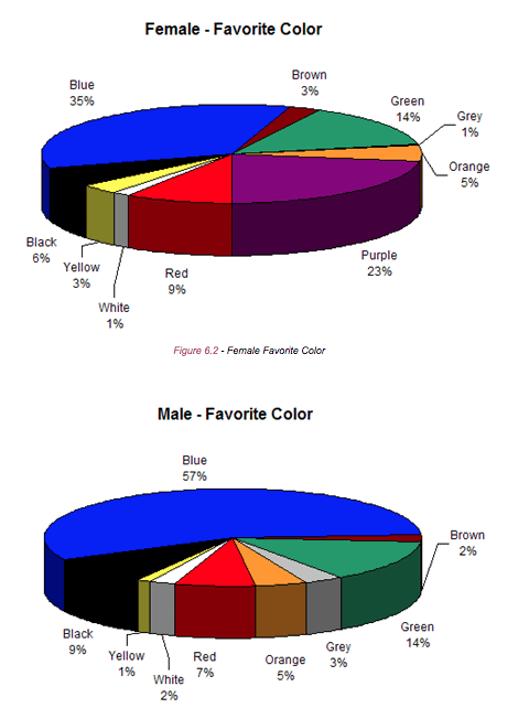
Other colors, such as red, blue, and green, had a fairly gender-neutral appeal, with similar preference rates between men and women.
Age has an effect on color preferences as well. Children and teenagers tend to prefer brighter colors than adults do, for instance. Senior citizens tend to like even more muted shades than younger adults. What's more, there are even distinct gender preferences within each age bracket.
You can work demographics into your color scheme by starting with a primary color that your target audience prefers. If you are trying to speak to a large and varied audience, look for a shade that has a lot of crossover appeal as your focal point. Then, you can create a unique identity based on the supplementary colors you include alongside that first one.
2. Accessibility
Designers are becoming more and more aware of the importance of accessibility in web design. When it comes to color, you'll need to consider whether your design will be legible to those who are color blind, and if the scheme you use has strong enough contrast for readers with poor vision.
You can use a contrast checker to boost accessibility, by entering the hex codes for your foreground and background colors:
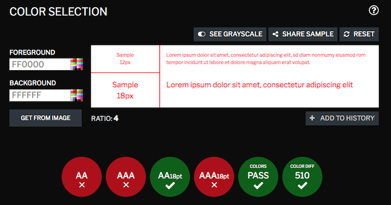
The contrast checker will display a passing or failing grade for each accessibility test. Ideally, you'll want to look for a color combination that passes all six tests. That way, your blog won't be excluding any potential readers.
3. Psychology
Emotional impact is another vital consideration, since some powerful psychology plays into how colors affect us. For example, red is often seen as aggressive, and blue tends to be calming. There’s a reason meditation apps like Calm often use blue tones:

On the other hand, reds are oranges seem to make people hungry, so you may consider them for a cooking blog:
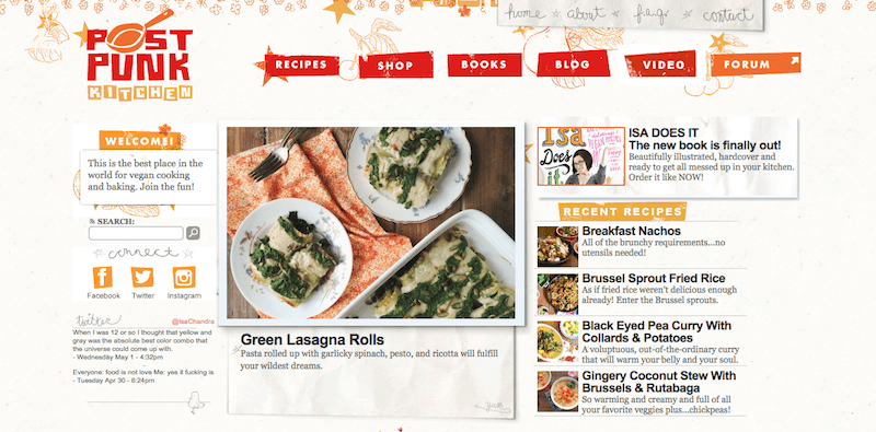
Even if you do use a strong shade like red, however, be careful not to let it dominate your design. You'll notice that in the above example, it’s only used for a pop of color on the buttons and in the logo. It's often smart to focus on more neutral colors to avoid overwhelming your readers, and use bolder hues as accents.
4. Color Harmony
Finally, you'll want to think about color harmony. In other words, which type of color scheme will you use?
Each of the color schemes we described earlier produces a different psychological effect, which will have an impact on how people perceive your blog. For example, monochromatic schemes tend to feel more “neutral”, while a tetrad scheme may feel chaotic if not carefully implemented.
You can use a tool like Paletton or the Sessions Color Calculator to generate a color scheme:
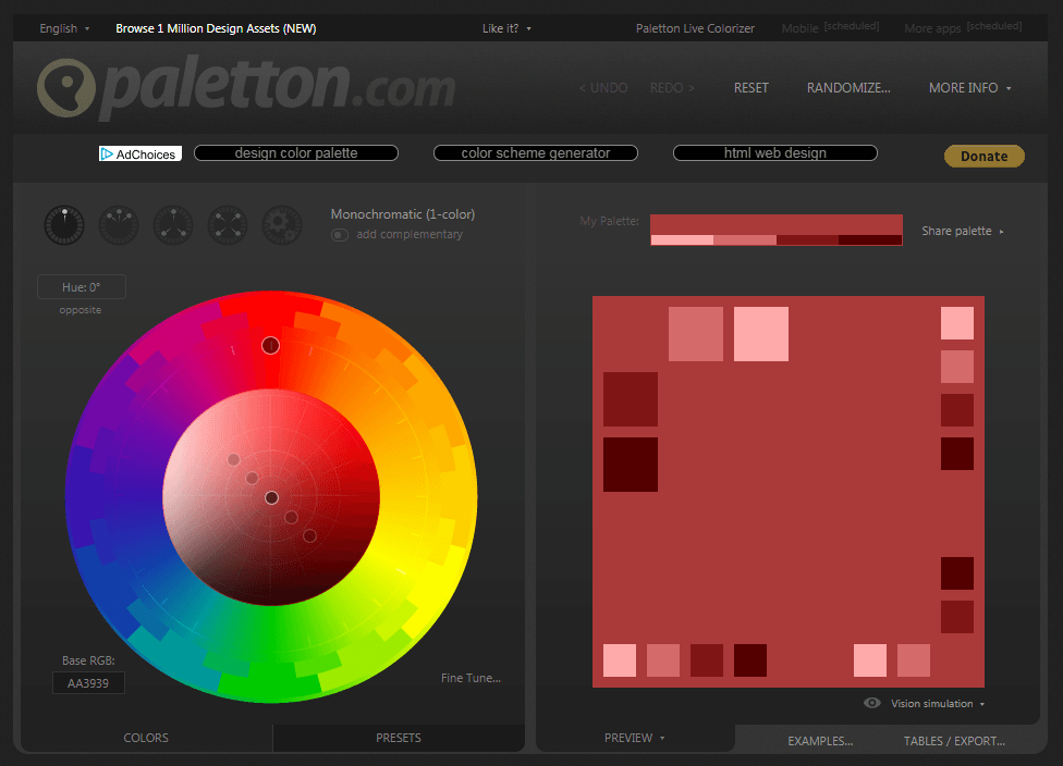
Find one color you like, and experiment with the different types of color harmony until you come across a combination that feels right. You don’t have to adhere rigidly to your color harmony scheme, but you can use it as a blueprint for your blog's overall look.
Conclusion
A strong aesthetic is crucial to maintaining an audience for your blog. A poorly-designed site can increase your bounce rate, so it’s important to choose a color scheme that is inviting to your target demographic and sets the desired mood.
The four most important things to consider when choosing a color scheme for your blog include:
- Demographics
- Accessibility
- Psychology
- Color harmony
Do you have any other questions about how to choose a strong color scheme for your blog? Let us know in the comments section below!
About John Hughes
John is a blogging addict, WordPress fanatic, and staff writer.
Sayan Kumar
July 22, 2021
Hey John, do you think I need to choose color for my blog depending on the types of audience I have in majority(for e.g male or female) . Or should I choose according to the niche?
ritusharma
August 7, 2021
For stable color tones, monochromatic is the best to select.
Ruksar
August 30, 2021
Good This was helpful